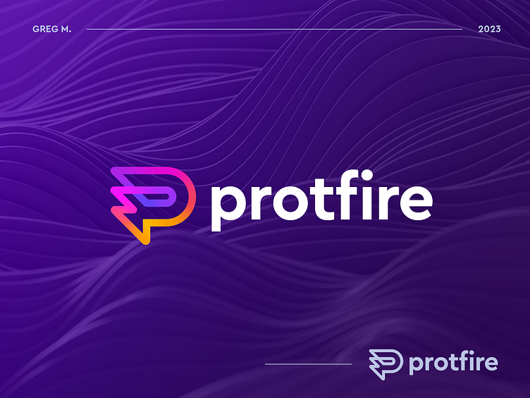
Protfire logo concept
Unused direction for Protfire, a design agency. Behind the idea of the logo is the letter P, fire and vivid, burning colors - this was to reflect the spirit of creativity, intensity and direction of agency ideas.
What do you think about it?
If you want to work with me, just tell me:
More by Greg M. View profile
Like
