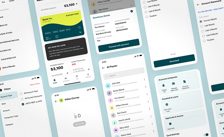
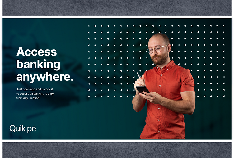
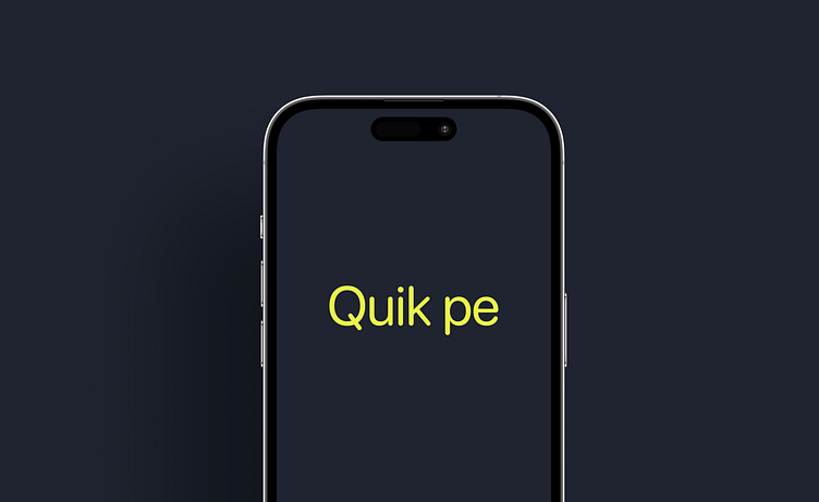
Quik Pe Banking Mobile App & Branding

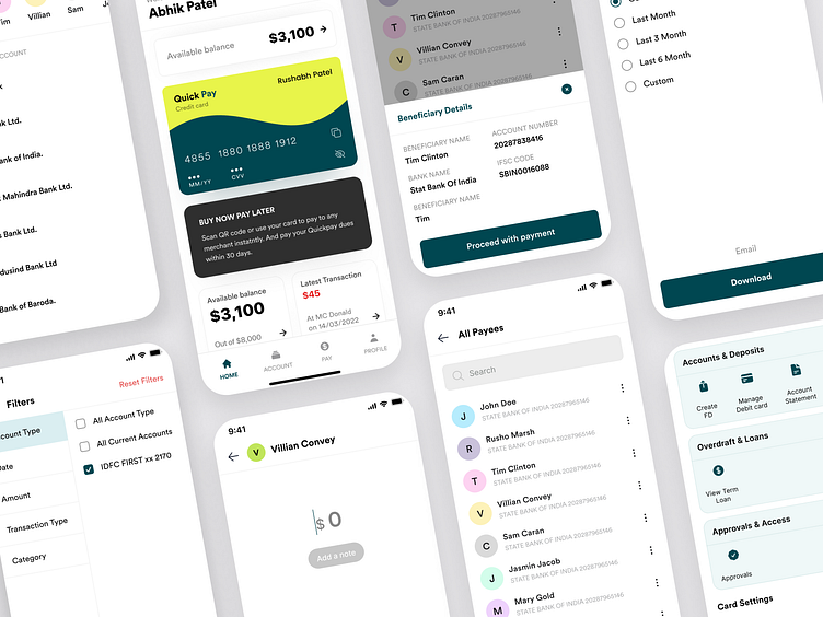
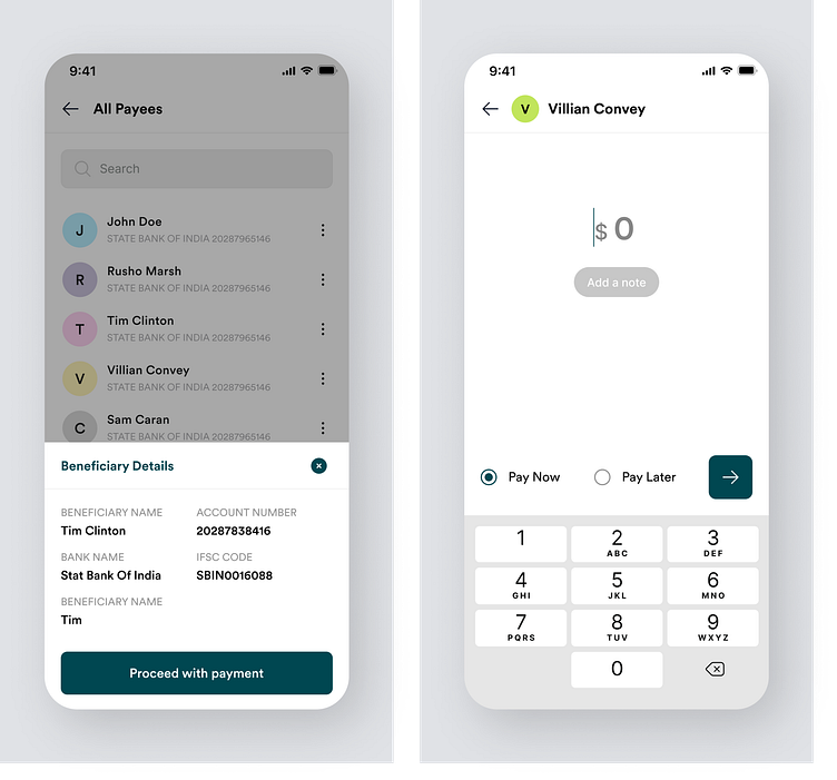
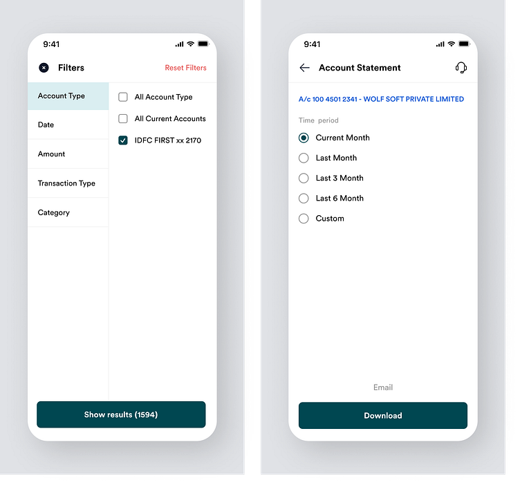
WOLFSOFT, has designed and created branding for a bank called Quik Pe. We helped them design the user interface and user experience (UI/UX) of their mobile app so that their customers can easily access all banking facilities from their mobile devices, no matter where they are.
Problem
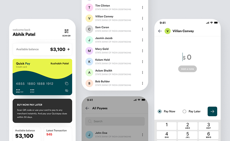
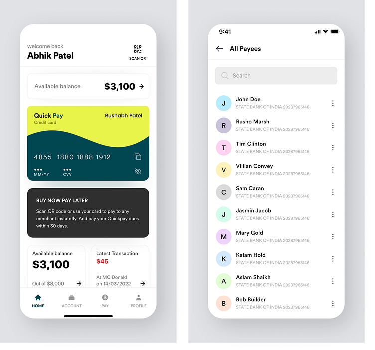
Currently, Quik Pe customers do not have access to online banking on their mobile phones. They have to wait in queues to make payments, apply for services, and use other banking facilities.
The solution
We understood the technical challenges and the main concerns of their customers. Since the majority of their customers are young people, we designed the mobile app using the latest UI/UX studies and provided the best branding and design solution. Now, customers can enjoy a seamless and convenient banking experience through the mobile app.
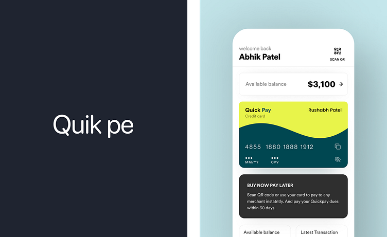

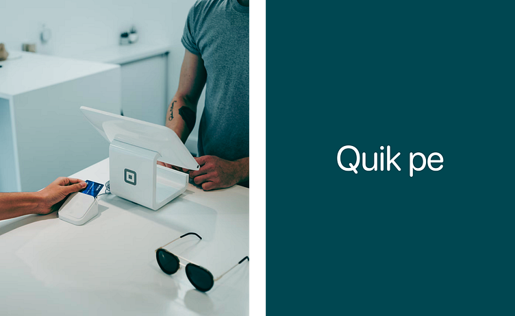

Expanding their iconic brand.
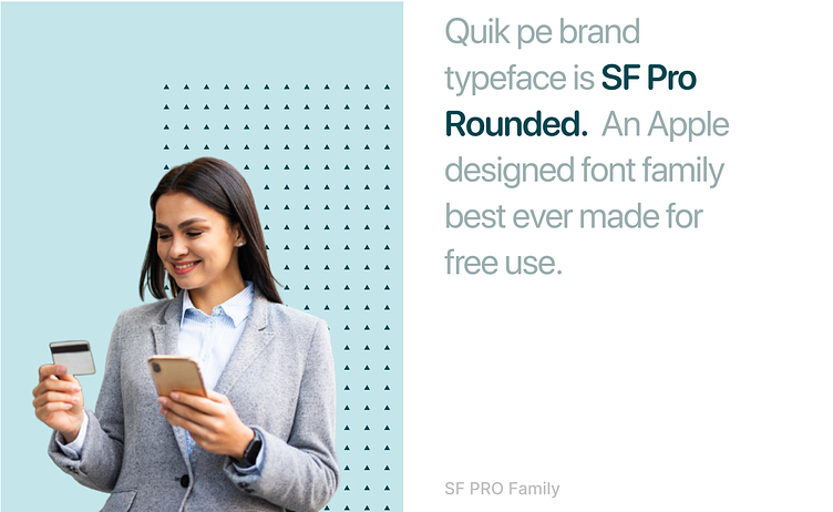
The initial requirement did not include changing the brand, which is why we chose to utilize the existing logo and adjust the size and spacing of the three-lettered mark. Throughout the process, we experimented with different color schemes, applications, typography, and photography techniques.
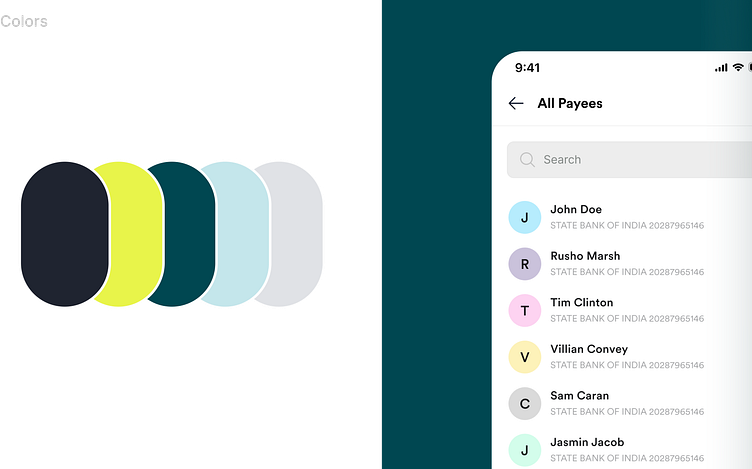
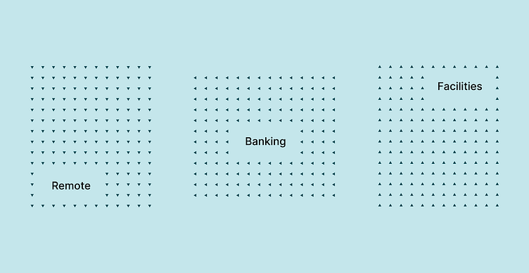
Considering that QuikPe has coined the tagline "Connecting the dots," with Quik as the central point of a complex ecosystem consisting of people, businesses, and services, we decided to incorporate the concept of "Human connection" by introducing directional patterns as brand elements. With valuable guidance from The Quik Pe team, we further developed this idea by introducing concentric patterns, which brought fluidity and visual dynamism to the brand.

Have a project in mind? Let’s get to work.
Contact us on [email protected]
instagram : https://instagram.com/uidesigner_rushabh
Behance : https://www.behance.net/rushabhpatel381
Website : https://wolfsoft.in/