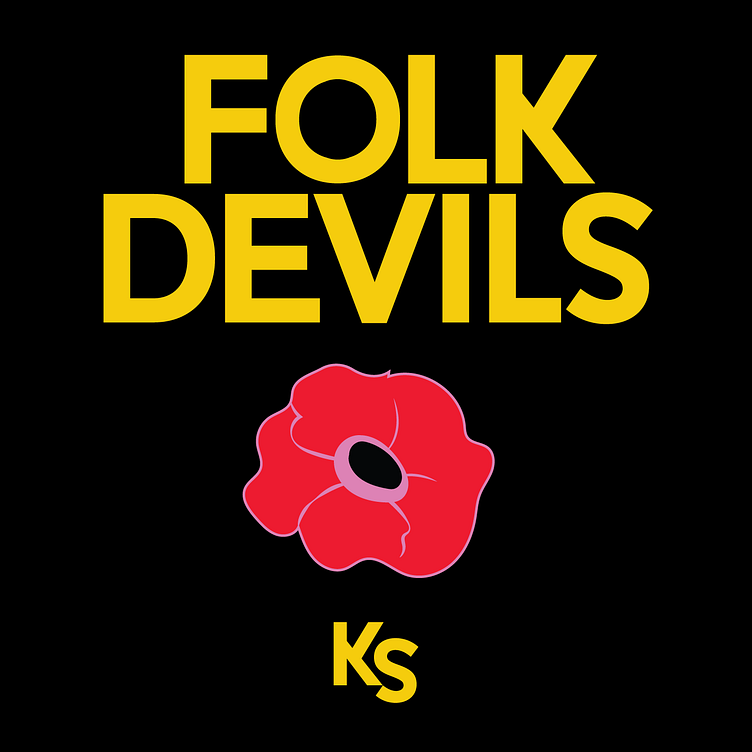
Folk Devils Custom Type
For Folk Devils, a NY based interactive design studio, the brief was to scare competing designers and play against type. The solution was to make subtle and not so subtle alterations to the letter forms which would still come together as a successful logotype. The most obvious are the K and S but there are other more subtle typographic horror shows in there, if you can find them. The choice of traditional (static) type and illustration was a bit of a bold choice for an interactive studio, and likewise lead to the “KS” as the obvious choice for the favicon.
More by Brian Saul View profile
Like
