e-learning platform: a case study

🧚🏼♀️ Hi!
I am Polina, a Product Designer and a Digital Nomad.
I make meaningful products through user research and a deep understanding of human behaviour. With a background in graphic design, I have honed my skills in creating aesthetically pleasing and functional products that enhance user experience.
In 2022, I took the UX&UI Course with Experience Haus. Throughout 10 weeks, I delved into the core principles of product design, establishing a solid foundation and gaining comprehensive insights into the field.
The course was immensely valuable, equipping me with core skills in Figma, adept structuring of design processes, and skilled execution of stakeholder and user interviews. This experience provided an engaging entry into product design.
💛 My heartfelt gratitude goes to my mentor, Érin Delaney, whose guidance has been pivotal in my professional growth.
Our client
Learn to Learn (LTL) is a new English language learning provider based in the UK and founded by Camila, an experienced language teacher with 8 years teaching and training. The ‘LTL method’ is based around the Common European Framework of Reference for Languages (CEFR) and combines a fun interactive learning experience with a 100% synchronous approach.
They combine English language learning with ‘soft skills’ to help learners build knowledge, skills and values required to live and work globally.
After testing the product initially in Chile, LTL’s big ambition is to expand into the European and UK markets, increasing profits and repurchase rates within 12 months.
Mission
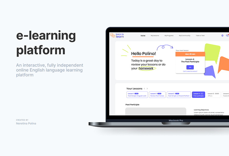
To produce a simple and efficient interactive learning platform, combining access to lesson booking, learner profile, progress tracking, video lessons, chat interface and access to additional learning materials in one place. Ensuring that this is cohesive with the new website and branding.
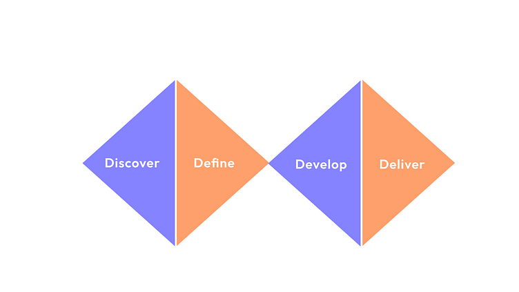
1. Discover
Steps:
Stakeholder Interview
User Interview
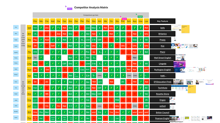
Competitor Analysis

Key findings
🔸Direct competitors have their own learning platform
🔸Direct competitors have good social media presence
🔸Not many direct competitors provide students with a certificate upon completion of the course
🔸Not many direct competitors have a community that would provide advice and support
🔸Most direct competitors focus solely on language skills, no soft skills applicable to life
🔸Not all direct competitors provide life lessons and progress-tracking tools that contribute to the accountability
Research Conclusion
💻 The desktop version should be the main platform used by students to connect to life lessons, however, the mobile version can be developed to supplement learning on the platform.
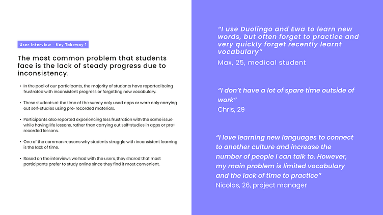
📈 Since most students struggle with consistency due to a lack of intrinsic or extrinsic motivational factors - community, progress tracking and means of communicating with a tutor should be the key elements of the platform.
🍬 A muted colour palette, and minimal illustrations design - otherwise, students may feel too visually overwhelmed.
2. Define
Steps:
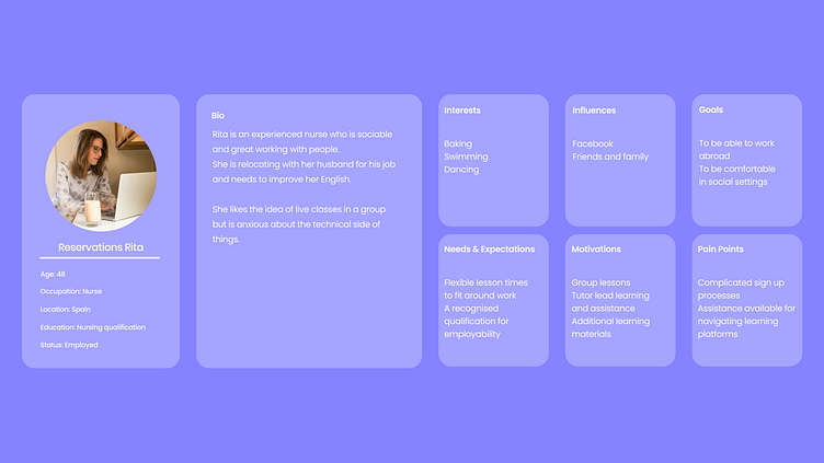
User Persona
Empathy Map


The problem
Learn2Learn needs a way to make all course tools (zoom, peardeck, googledocs) accessible in one location because currently the student and teacher experience is complex and overwhelming.
We believe that by bringing everything in one place for students and teachers we will create a simple and efficient platform for all users.
We will know this to be true when students are spending less time across multiple applications.
Vision & Solution
🔸Create as simple and efficient an interactive learning platform as possible
🔸Include access to lesson booking, profile, progress tracking, video lessons, chat interface and access to additional learning materials in one place
🔸Show a way for teachers to report on student progress from lessons and for students to detect weak areas/where to build on
🔸Multi-control for students and teachers in one on one and group lesson settings
🔸Ensure it looks cohesive with the new website/branding
3. Develop
Steps:
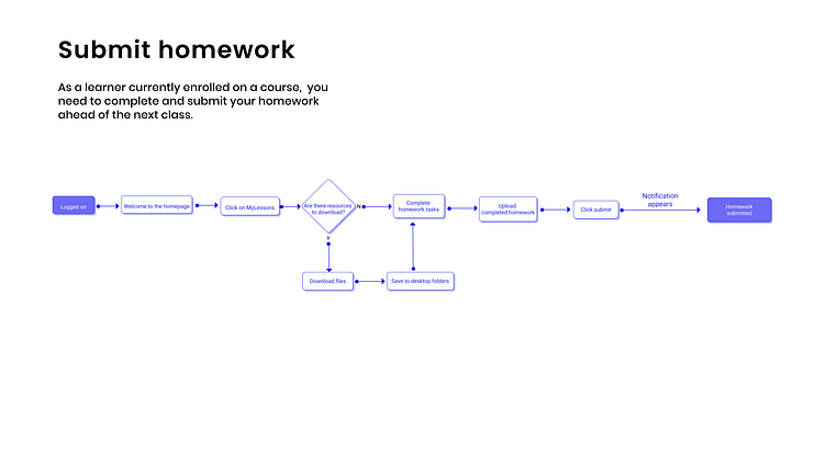
User Flows
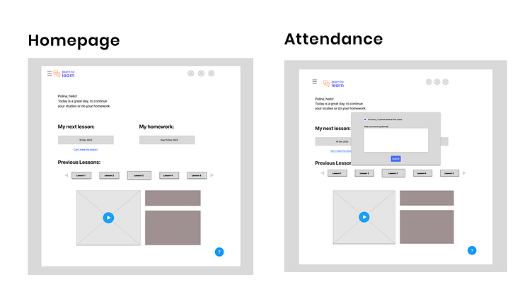
Wireframe
Branding Exploration


Branding Exploration
After finalising our wireframes we then refined the brand elements, building on the existing visual identity such as the colour palette and logo design and extending it into illustration and UI components.

4. Deliver
Steps:
Prototype
User Test
Next steps
Prototype testing feedback
💚 Users love the colours and design as feels bright and welcoming
💚 They liked the simplicity of the UI elements
💚 Clear to navigate
🆘 Some of the terms in the top navigation bar are not familiar to the user and so it is not how how they differentiate from one another
🆘 Users found the lessons carousel to be unclear both in terms of which topics they relate to and also which lessons are in the past or upcoming
🆘 Some confusion over the Lessons page and which elements related to the homework