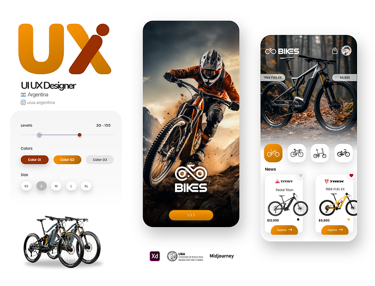
Bike app design
Hey Dribbblers 👋
Here is the new concept App. Press "L" if you like it ❤️
We are open to new projects!
The Pivotal Role of UI Design in a Mountain Bike Sales App
In the highly competitive world of e-commerce, a top-notch User Interface (UI) design is crucial for any application, and this is especially true for an app focused on the sales of Mountain Bikes (MTB). Let’s delve into the facets of UI design that make it indispensable:
1. First Impressions and Visual Appeal
The app's UI design is essentially its face to the world. A clean, modern, and attractive design ensures that the application makes a good first impression. Leveraging color theory, typography, and responsive layouts can significantly enhance the visual appeal of the app.
2. Usability and Navigation
Ensuring that users can easily find and browse through the various MTB options is crucial. Effective navigation patterns and information architecture are the keystones in making this happen. Additionally, employing universally recognized icons and intuitive UI elements streamlines the user's journey through the app.
3. Accessibility
An inclusive design is a must. By ensuring that your app is accessible, you cater to a diverse audience, including those with disabilities. Utilizing high-contrast colors, scalable text, and screen reader compatibility are some of the ways to achieve this.
4. Mobile Responsiveness
Given that a significant percentage of users will be accessing the app via mobile devices, mobile responsiveness is a non-negotiable feature. Fluid grids, flexible images, and media queries are some of the techniques to ensure that the app adjusts to different screen sizes and resolutions.
5. Loading Speed and Performance
A well-optimized UI design ensures that the app loads swiftly and performs smoothly. Compressing images, optimizing asset delivery, and minimizing HTTP requests are some ways to enhance performance, which directly correlates with user satisfaction.
6. Branding Consistency
Consistency in branding elements such as logos, color schemes, and fonts is key to building brand identity and trust. The UI design should ensure that these elements are uniformly presented across all pages and platforms.
7. Conversion Rates
The end goal is to sell MTB bikes. A UI design that employs principles of CTA (Call to Action) placement, hierarchy, and Fitts’s Law will result in higher conversion rates. This includes making the purchase buttons prominent and placing them in easily accessible locations.
8. User Feedback and Interaction
A good UI design will also incorporate elements that enable users to provide feedback and interact with the app effortlessly. This can be through review sections, ratings, and interactive chatbots for customer support.
9. Scalability
As the app grows, it should be able to incorporate new features and content without compromising the UI design. A modular design approach helps in ensuring the app can scale effectively.
In conclusion, an impeccable UI design is pivotal in determining the success of a Mountain Bike Sales App. It is a blend of aesthetics, functionality, and performance that culminates in a pleasing and efficient user experience, which in turn drives sales and brand loyalty.

