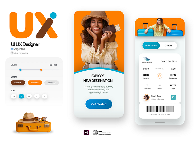
Travel agency app design
Hey Dribbblers 👋
Here is the new concept App. Press "L" if you like it ❤️
We are open to new projects!
The Quintessence of Stellar UI Design in a Travel Agency App
In a world where the digital realm continues to expand and thrive, a cutting-edge User Interface (UI) design is imperative. Especially for an app focusing on a travel agency that provides airline tickets, the interface becomes the window through which users experience the brand. Here is why an engaging and functional UI design is pivotal:
1. First Impressions:
An app’s UI is the first thing that users encounter. In the context of a travel agency, the competition is fierce. A visually appealing, modern, and clean interface can create an outstanding first impression.
2. User Experience (UX):
UI and UX go hand in hand. The layout, typography, color schemes, and graphics need to be cohesive. An intuitive navigation scheme and easy-to-find call to action (CTA) buttons for booking flights ensure that users find what they’re looking for swiftly. Seamless UX often translates to higher conversion rates.
3. Brand Identity:
Consistency in UI elements like color palettes, typography, and iconography can help in building a strong brand identity. This consistency should resonate with the travel agency's values, culture, and services.
4. Accessibility:
Inclusive design principles are vital. The app should be usable by a diverse audience, including those with disabilities. This can be achieved through ARIA (Accessible Rich Internet Applications) attributes, adjustable font sizes, and high contrast modes, ensuring WCAG (Web Content Accessibility Guidelines) compliance.
5. Scalability and Flexibility:
The travel industry is dynamic. The UI design should be scalable to accommodate new features and services such as holiday packages, travel insurance, or partnerships with hotels. A modular design system makes the app adaptable to changes.
6. Mobile Responsiveness:
With a majority of users accessing services through mobile devices, the app must be responsive. Fluid grids, flexible images, and media queries ensure the app adapts to various screen sizes and orientations.
7. Internationalization and Localization:
Travel agencies usually cater to a global audience. The app’s UI should support multiple languages, currencies, and region-specific content. This makes the app more relatable and user-friendly to a global audience.
8. Loading Times and Performance:
A slick UI is not just about looks; it’s also about performance. Optimizing images, leveraging browser caching, and using content distribution networks (CDNs) can ensure that the app loads quickly, even on slower networks.
9. Feedback and Error Handling:
Providing users with feedback for their actions is crucial. Whether it’s a booking confirmation or an error message, users should be guided through their journey with clarity.
10. Trust and Security:
Safety is paramount, especially when transactions are involved. The UI should clearly indicate security through SSL certificates and secure payment gateways.
In conclusion, an impeccable UI design in a travel agency app is not just an aesthetic endeavor but a comprehensive approach that encompasses user experience, accessibility, responsiveness, scalability, and security.

