Web design for Photographer
Web design for Photographer
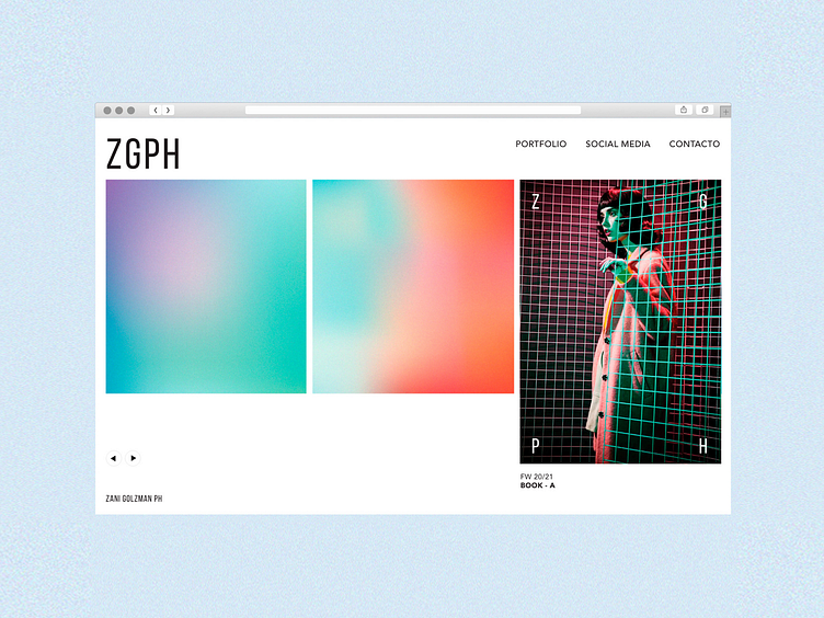
Here's the landing page I designed for Zani Golzman, a fashion and wedding photographer.
―
I wanted to to create a clean, versatile and bold—yet subtle brand.
“Frame and light” were the inspiring keywords and both color gradients and the resulting logo are based on that idea: strong and flexible, this brand opens out reinforcing the concept that “magic” happens through the photographer’s eyes.
More by Nat Destéfano View profile
Like
