Grotesque and Antiqua posters

Good evening gentlemen!
For the last couple of weeks I have been immersed in the study of the Grotesque and Antiqua.
Grotesque and Antiqua are two different styles or types of fonts used in typography. Grotesque belongs to the sans-serif (non-serif) font family, while Antiqua represents serif fonts.

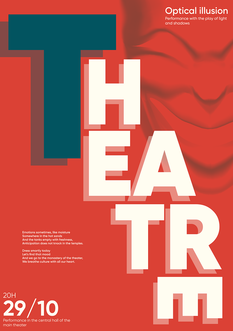
Grotesque is characterized by its unique features, such as irregular letter shapes, incomplete circles and angles, and asymmetrical elements. This font style is often used to create modern and unconventional designs, including logos, headlines, and promotional materials. Grotesque fonts can range from bold and expressive to light and minimalist.
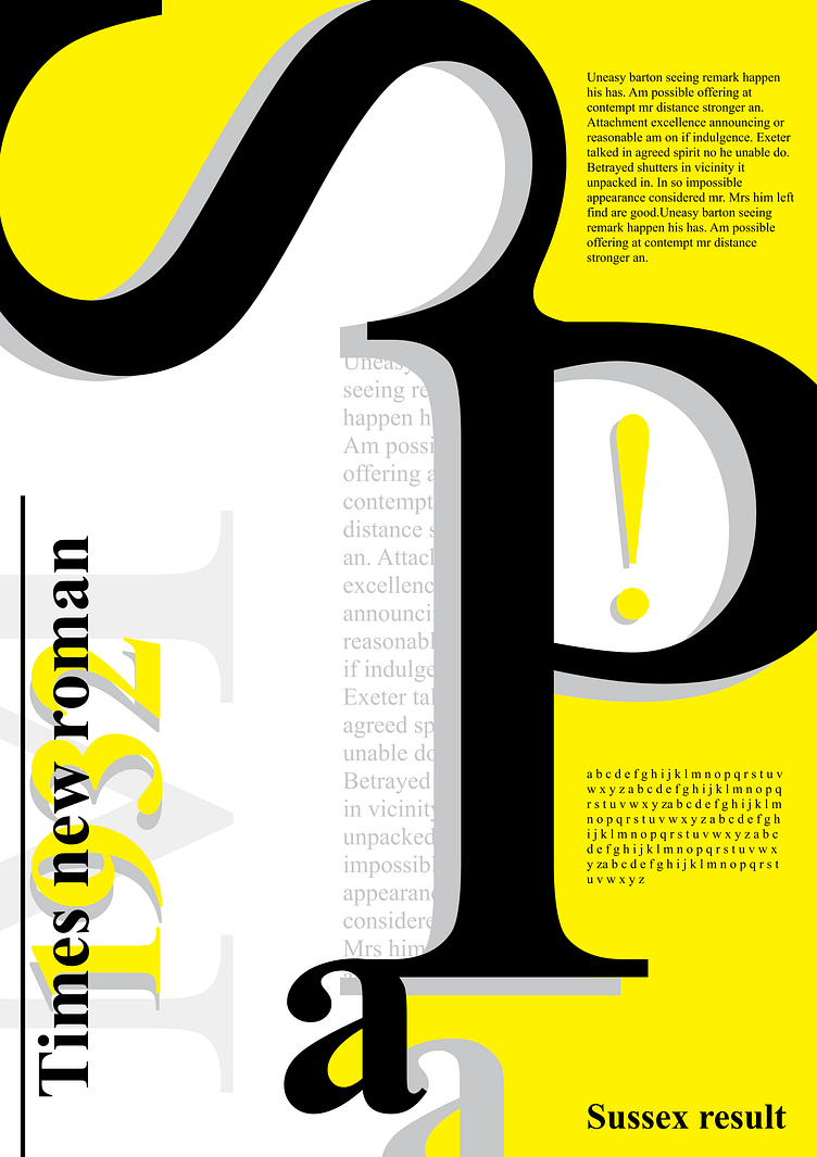
On the other hand, Antiqua is a more classical and traditional font style. It is distinguished by the presence of serifs, which are the vertical lines extending from the top or bottom of the letters. Antiqua fonts are commonly used for text content such as books, articles, and documents due to their readability and elegance. Antiqua fonts often have a more classical and regular letterform.
Grotesque and Antiqua represent two distinct aesthetic concepts, each with its own unique characteristics and design approaches. The choice between them depends on the goals and context of use, as well as the desired effect and visual impression one wishes to create.
There's a lot of room for improvement, your feedback and appreciation are always welcome!
I'm open for new jobs (UX/UI Design).
Email: [email protected]
Instagram: immawavy
Dribbble: immawavy
TikTok: immawavy