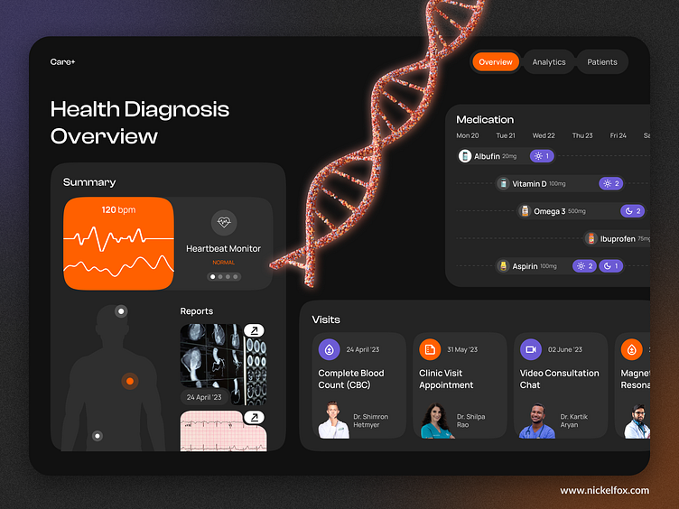
Medical Healthcare Dashboard Design
👩⚕️ Hey dribbblers! I'm thrilled to showcase Care+, an innovative healthcare dashboard that puts vital information at your fingertips.
Have an idea💡? Let's work together 🤝
Get a reply within 12 hours!
Discover more about us at Nickelfox.com | Youtube | Twitter
For Freebies, Click Here
🌟Designed to empower medical professionals, administrators, and patients alike, Care+ revolutionizes the way we interact with healthcare data. It simplifies the complexity of healthcare data by aggregating it into a sleek, intuitive dashboard. We've carefully crafted a clean and minimalist interface that allows users to effortlessly navigate through vast amounts of information, transforming it into actionable insights.
🎨Color Palette
The color #FF6000 is a vibrant and energetic shade of orange. On the other hand, #6C5BD4 represents a deep, rich shade of blue-violet.
When using #FF6000 and #6C5BD4 together in a healthcare dashboard design, they create a visually striking and dynamic color scheme. The contrasting warm and cool tones generate a balanced visual experience, capturing attention while maintaining a sense of professionalism and trustworthiness.
✏️Typography
The concept behind using Clash Display is to create a design that is bold, impactful, and attention-grabbing.
The concept behind using Manrope is to create a design that is modern, approachable, and versatile.
Press 💖 if you like our design and share feedback!


