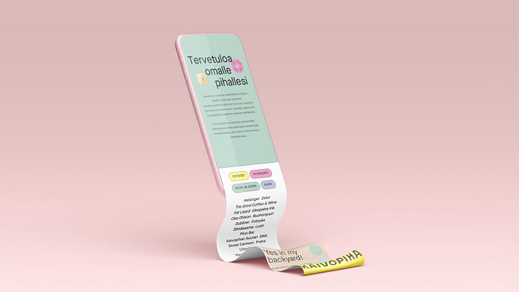
Case: Kaivopiha.fi redesign
Sometimes a full rebuild is necessary
Kaivopiha stands as a historic landmark in the heart of Helsinki, serving as a cherished meeting place, shopping center, and dining area for decades. Operated by Ylva and owned by the Student Union of the University of Helsinki, Kaivopiha also serves as the fastest route from the city's central railway station to the popular Aleksanterinkatu shopping street, appealing to both citizens and visitors.
Following the completion of Ylva's extensive renovation of the 7000m2 city block, a comprehensive rebranding effort was undertaken, including the commissioning of a new brand identity for the brick-and-mortar-meets-shopping-mall area. This encompassed the creation of a landing page designed to disseminate news about events. However, it soon became evident that the existing website, originally conceived for a soft launch, was ill-suited to scale according to their evolving needs. The absence of an in-house developer further compounded the challenge of updating the hardcoded page.
Our goal
Our primary objective was to develop a website that facilitated effortless updates to tenant information while simultaneously accommodating the dynamic requirements of the marketing team through engaging landing pages for campaigns and events. Given the relaunch coincided with the COVID-19 pandemic, there was an additional imperative to swiftly update content related to restrictions, regulations, and safety.
Methods & tools
Facing a looming deadline, I adopted an improvisational approach, drawing on extensive research, benchmarks, and analysis from the initial rebranding project. Leveraging this foundation, I engaged in discussions with the client to gain a deeper understanding of their needs and those of their stakeholders. The final wireframes were meticulously crafted using Figma, and the website was expertly developed using Webflow.
Above: The original front page design.
Key findings
In conversing with the client, it became evident that the project team comprised representatives from disparate teams, each with unique goals and requirements. The premise management team sought to maintain an updated list of tenants and the area map, while the communications and marketing team required responsive templates for articles, landing pages, and ad campaigns. Crucially, these tasks needed to be accomplished through an easily navigable backend without the necessity for coding.
Despite the client's familiarity with WordPress, their dissatisfaction stemmed from the laborious process of making UI or fixed element changes on other sites. This involved teams reporting changes to an intermediary, who then compiled a list for an external developer. This cumbersome process often led to prolonged implementation times, with new requirements emerging before previous changes could be realized.
Solution
A pivotal change involved transitioning the entire site to Webflow. Beyond providing a no-code visual editor for designers, Webflow boasts a user-friendly content management system, and its editor mode allowed us to grant precise access to the content that users needed to update. Using Webflow, we compartmentalized page content into distinct CMS sections, tailoring fields and features based on end users' control requirements. Additionally, we employed the CMS feature to construct sets of templates for various campaigns, ensuring the site's scalability for the client's future expansions.
Key changes
By leveraging Webflow, we successfully addressed the client's concerns regarding workload and implementation time. The absence of coding expertise did not hinder us, as the visual editor enabled the creation and management of a lively and lightweight experience without the need for an intermediary for UI changes.


