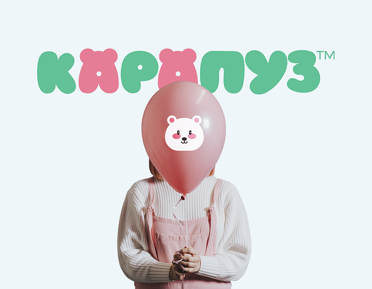
Food company "Карапуз" Redesign and Packaging
The logo is formed from convex round letters that look like balloons. The actual logo is the word "КАРАПУЗ". The letters "A" encode a bear (its ears are depicted) - the main character of the corporate style, which appears on the packaging. For emphasis, these letters differ from the entire inscription in color.
View all tags
Posted on
Jun 23, 2023
More by Kateryna Kukharieva View profile
Like


