Newman Contracting - Client

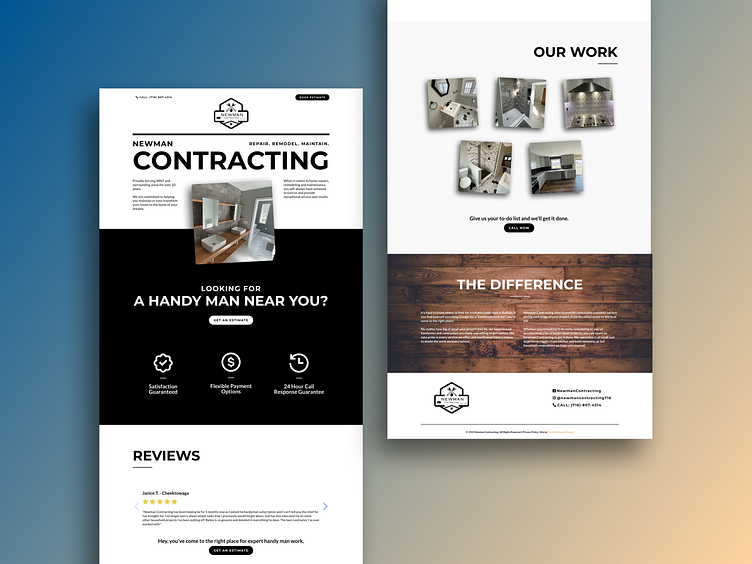
This project was just completed for a client today. Here are the details of why I designed this particular landing page the way I did.
The offering was simple with very little depth, so I stuck with a minimalistic design.
There was no color palette or branding guide, so I went with the logo as the standard for design.
The logo was large and could not be reduced in size almost at all per the tiny font which I was not hired to redo the logo, so I worked with it and made it a large part of the header.
Big and Bold was the motto here. Thus, the large lettering in uppercase, telling the web page visitors exactly what this page was about in a fraction of a second.
I felt like the hero banner shared some similarities with newspapers and tied this in to the idea that hand man work and contractors have been around for decades. In fact, their logo seemed old fashioned. The shoe fit.
And, the black and white high contrast was also a steal from the logo, with a dash of gray and the wooden background near the footer to add some character.