soirée
Soirée Brand Identity
Naming / Logo / Visual identity / Packaging
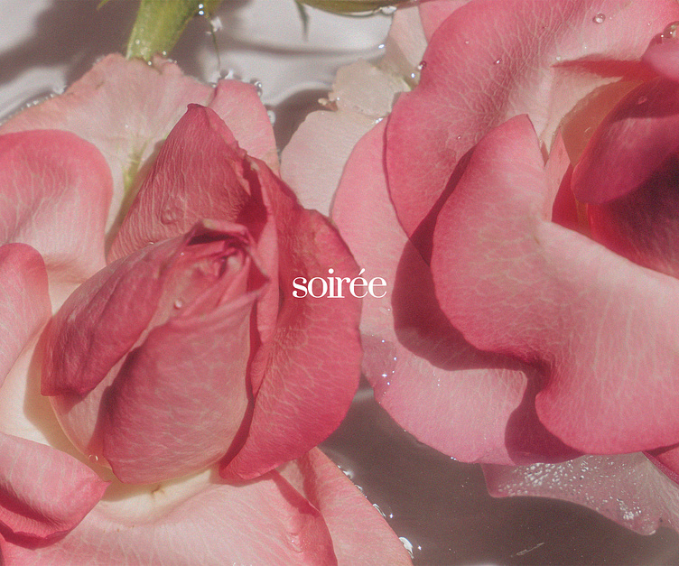
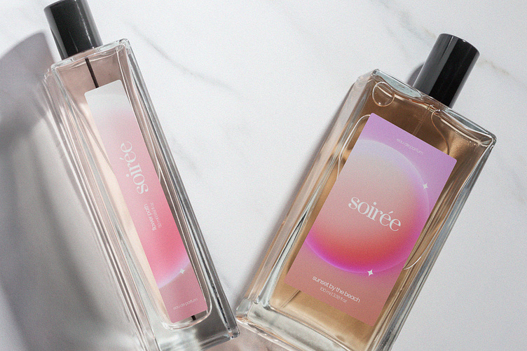
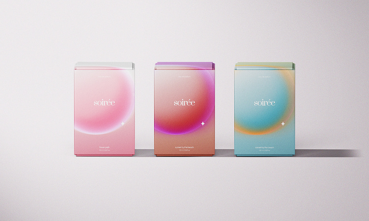
Soirée is a perfume brand. The name comes from french word "soirée" which translates to "evening". It's corporate identity has been developed and it includes the naming, logo, corporate colours, typography and the packaging design. The logo is minimalist and delicate and it prioritise it's legibility and it's elegance. The corporate colours are made up of white as the primary colour of logo and the text, and pink, red and blue, along with the three unique backgrounds that can be seen below.

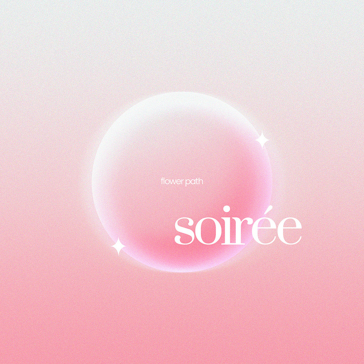
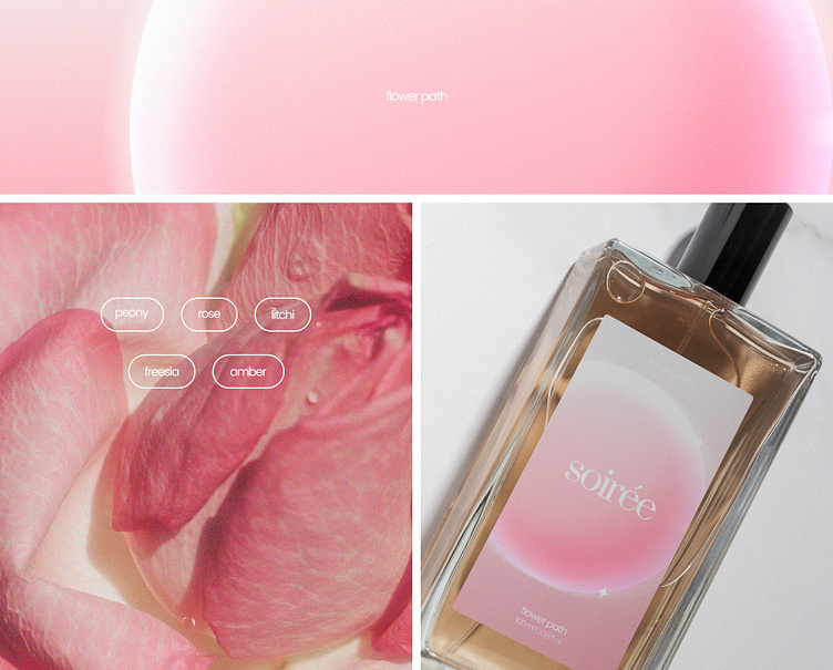
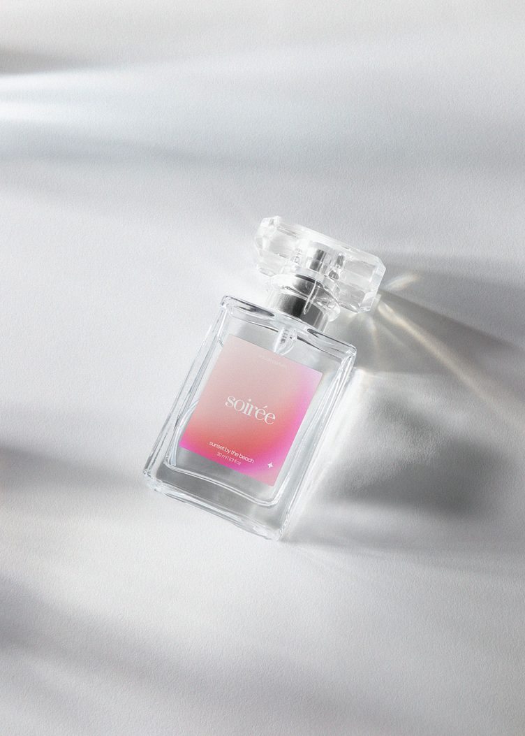
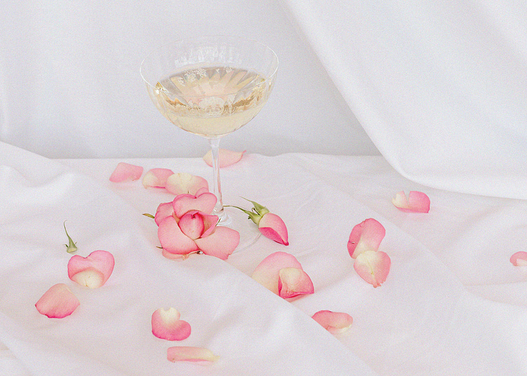
Soirée is composed of three scents, with each one of them represented by a colour of all of them following the same scheme. Flower path is made up of pink tones, being this colour represented by it's main notes, rose and peony; "flower path" refers, as its name indicates to a path full of flowers and the tonalities and scents that can be found in it.
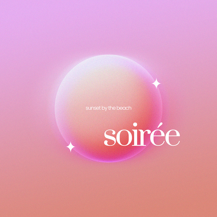
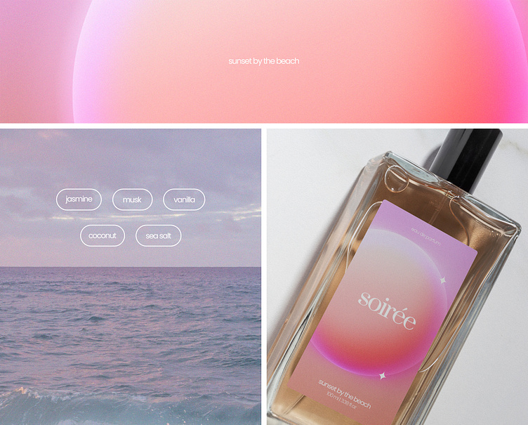
Sunset by the beach is made up of tones that are reminiscent of the sunset with some of its main notes being coconut and sea salt.
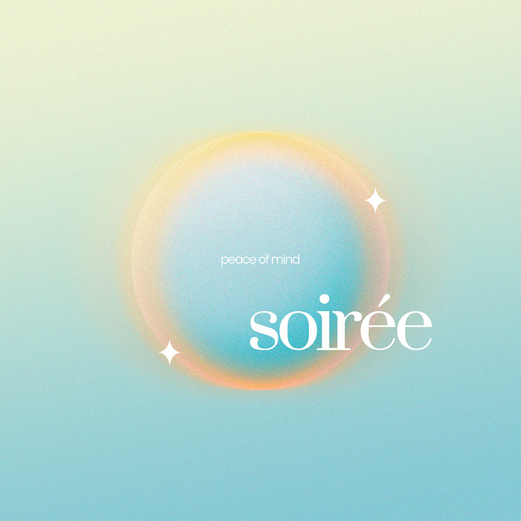
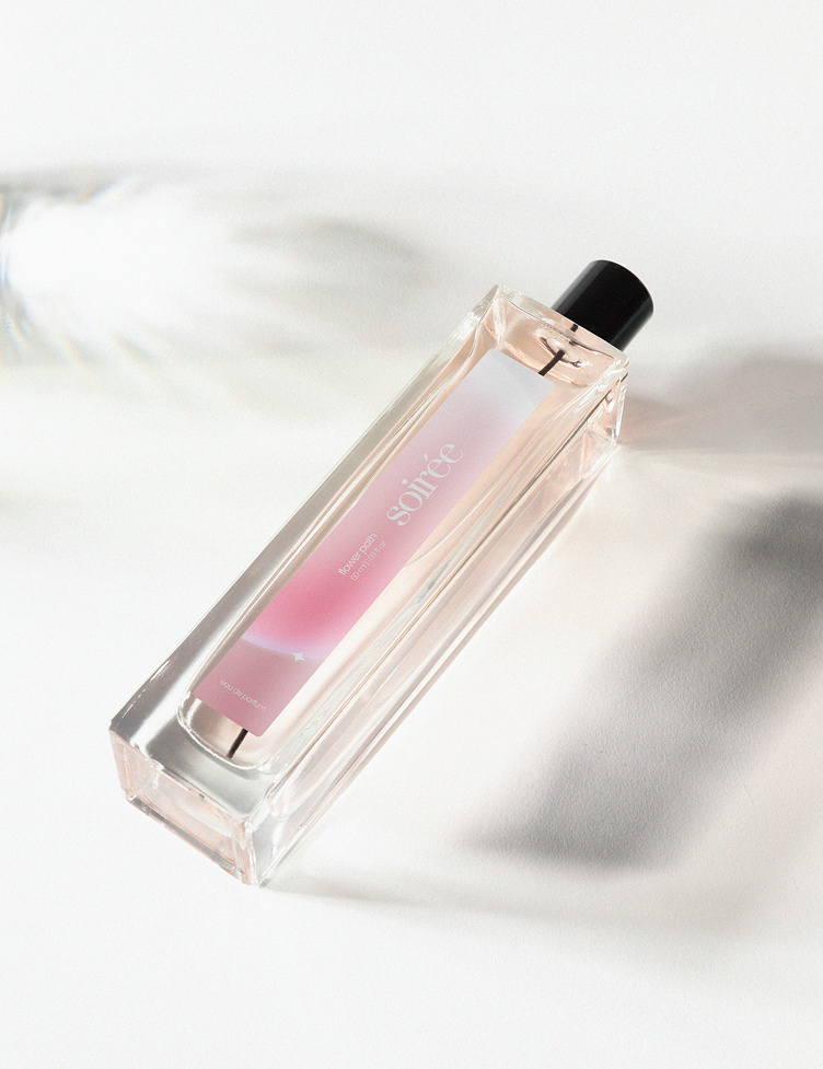
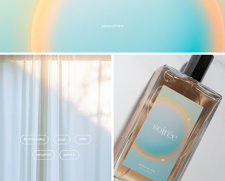
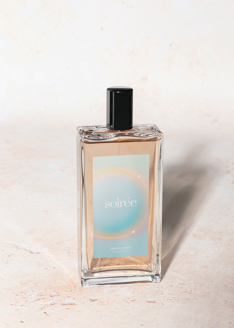
Peace of mind is made up of light and soft colours which emits tranquility to the mind, with some of its main notes being musk and pear. Finally, "a drop" that refers to the product represented can be seen in all designs. The perfumes comes in the three different formats that can be seen below; 100ml, 50ml, 30ml.
Soirée Brand Identity
Art direction & design: Krushik Soni
Date: November 2022
