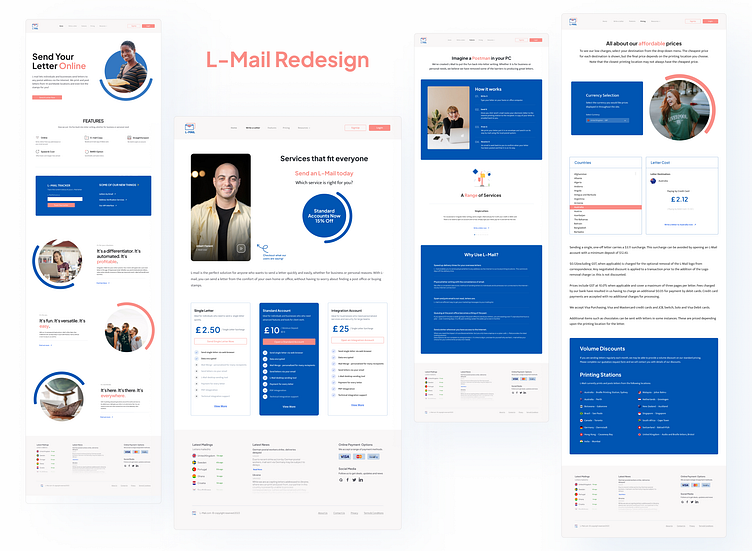
L-Mail.com Redesign Concept
Up next on my personal project of website redesigns is the L-Mail website.
L-Mail is an online platform that allows users to send physical letters around the globe 🌎.
The L-mail site is basic in content and structure. So, my goal was to improve content organization, site structure, user experience and visual design.
Check out the current website: (https://l-mail.com/)
New Homepage ... ⤵
I wanted my redesign of the L-Mail homepage to give users a more vibrant and stimulating atmosphere. Through the use of colorful visuals, simple icons, and graphic elements, users will be able to use and interact with the website in an attractive way.
New Elements, New Feel
In order to reinvigorate the website, a few new elements and colors were added. This includes minimal logo designs, pastel colored navigations (nav bar & footer) and bold hero sections
This personal redesign project was a great experience as usual. It is always a learning opportunity to take an existing website and challenge myself to improve it in some manner.
-
💛


