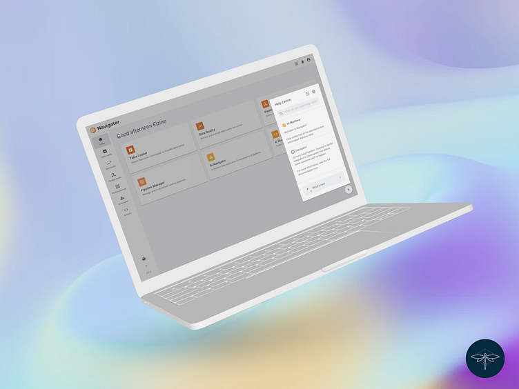
Help Centre
Project overview
Navigator is a data and analytics platform that can unify data, analytics, and AI workloads. Navigator provides you with the ability to ingest any type of data from any source.
Help centre is a feature in Navigator that gives contextual help throughout the platform and is there to assist users whenever they get stuck. Following the 10th usability heuristic for interface design from the Nielson Norman Group, the help centre is easy to search and focuses on the user's task.
As the exclusive designer responsible for Navigator, I collaborated closely with the developers in the Navigator team to enhance the existing platform. Working under the guidance of my team lead, my responsibilities encompassed conducting research, enhancing user flow, and improving the overall user experience. I actively took part in both conducting and assisting with user testing on the platform as well. I utilized our internal design system to supply UI designs. In some cases, I had to create new assets that aligned seamlessly with the design system, ensuring consistency.
After its initial implementation in Pipeline Studio, the introduction of the help center was well-received. Consequently, there was a request to incorporate it into other applications within the platform. This need arose due to users not always being familiar with the platform and the desire to provide comprehensive assistance whenever possible.
User testing
We did user testing on Navigator in August 2022 and tested help centre as a feature within the platform. We tested internally with users that were familiar with the platform and concepts. Our main goal was to determine their understanding of the ecosystem and whether they understand the complexity around data management.
Our objective was to assess the usefulness of the help centre across the entire app and determine the frequency with which users relied on it.
Help centre received really good feedback. Users seemed to really like the feature, however some of the users were unaware of the feature and others did not want to rely on using the feature.
In an attempt to try and make the help centre more user friendly and to get users to engage with it when they got stuck, the following updates were made:
I looked at the type of users that use the platform, ranging from inexperienced to novice and look at the different journeys each will take as well as how reliant they will be on using the help centre.
I looked into introducing interactive mechanisms to encourage users to use help centre as well as improve the usability and enhance the user experience through delightful engagements.
Persona cards and task flow for help centre ⤴
Wireframes ⤴
New UI for help centre that features interactions like a pulse indication when user becomes inactive and gets stuck (it was noticed during testing that users would pause for a moment when they did not know what to do next) ⤴
Micro interactions and animations were added to create a delightful user experience ⤴
Demos and interactive walkthroughs were added to assist users with tasks ⤴


