Car Rental Design System
A bold approach
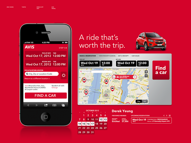
Our team helped Avis develop one of the first car rental mobile apps in the market. Soon after, Avis began work on rethinking their global brand with a cleaner design, complete with a refreshed logo. In full embrace of their signature color, we flattened the design and created several noteworthy innovations along the way. One of the key insights learned in this effort is the concept of “Economy of Motion” where we pair interactions in the smallest amount of distance possible. Along with increasing speed, this has a way of naturally coupling contextual information and opens new avenues for design.
The app work opened up doors to bring the digital brand update to the web version.
In addition to these new opportunities for the company, on a personal level, this was the first project where I had free rein to do everything from UX and design to client interactions and selling, an important leap for any designer.
