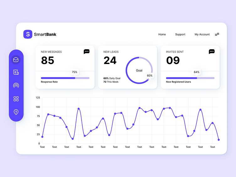
Dashboard Design Light and Dark Mode
Dashboard Design
plays a crucial role in delivering information effectively and enhancing user experiences. Here are some key considerations and principles to keep in mind when designing a dashboard:
Clarity and Simplicity: Aim for a clean and uncluttered design that allows users to quickly grasp the information presented. Use clear and concise labels, icons, and visualizations to minimize cognitive load and facilitate intuitive navigation.
Hierarchy and Organization: Prioritize the most important information and arrange it in a logical hierarchy. Group related data together and use visual cues such as color, size, or typography to differentiate between different levels of importance.
Data Visualization: Utilize appropriate and meaningful visualizations to present complex data sets in a digestible format. Choose the right chart types (e.g., bar graphs, line charts, pie charts) that effectively convey the intended message and allow users to derive insights at a glance.
Responsiveness and Adaptability: Ensure that the dashboard design is responsive and adaptable to different screen sizes and devices. This enables users to access the dashboard seamlessly across various platforms, including desktops, tablets, and mobile devices.
Consistency: Maintain a consistent visual language throughout the dashboard, including color schemes, typography, and iconography. Consistency fosters familiarity, improves user understanding, and establishes a cohesive user interface.
User-Centric Approach: Understand the needs and goals of the target users and design the dashboard accordingly. Consider their workflows, tasks, and the specific data they require to make informed decisions. User testing and feedback can help refine the design and ensure it aligns with user expectations.
Interactivity and Drill-Down Capabilities: Provide interactive elements that allow users to explore data in-depth. Interactive filters, drill-down menus, and tooltips can enable users to investigate specific data points and uncover insights based on their individual requirements.
Performance and Speed: Optimize the dashboard's performance to ensure quick loading times and smooth interactions. Large datasets or complex calculations should be handled efficiently to avoid delays and frustration for the users.
White Space and Visual Balance: Utilize white space effectively to create a balanced and harmonious layout. Adequate spacing between elements helps users focus on essential information and reduces visual clutter.
Accessibility: Consider accessibility guidelines to make the dashboard usable by a wide range of users. Ensure appropriate color contrast, provide alternative text for images, and make the dashboard navigable via keyboard for individuals with disabilities.
=========================
Want me to help you with your project & idea?
Contact me [email protected]
Follow my Instagram
=========================
Have a nice day 💫


