Case Study: Rebranding IPTS as Shuddle


Introduction
As a UX Unicorn, I blend design and development, bringing a unique perspective to my role as Head of Digital at Interplanetary Travel Syndicate (IPTS). My journey involved the design of three distinct websites: a news site (ipts.org), a travel booking platform (rebranded as Shuddle Visit), and a real-time commute tracker (rebranded as Shuddle Ride). From these, I translated the design of Shuddle Ride into functional code, bridging the gap between aesthetics and functionality. This case study provides insights into the research, design, rebranding, content creation, and technical implementation processes, highlighting my unique ability to navigate both the design and coding realms effectively.
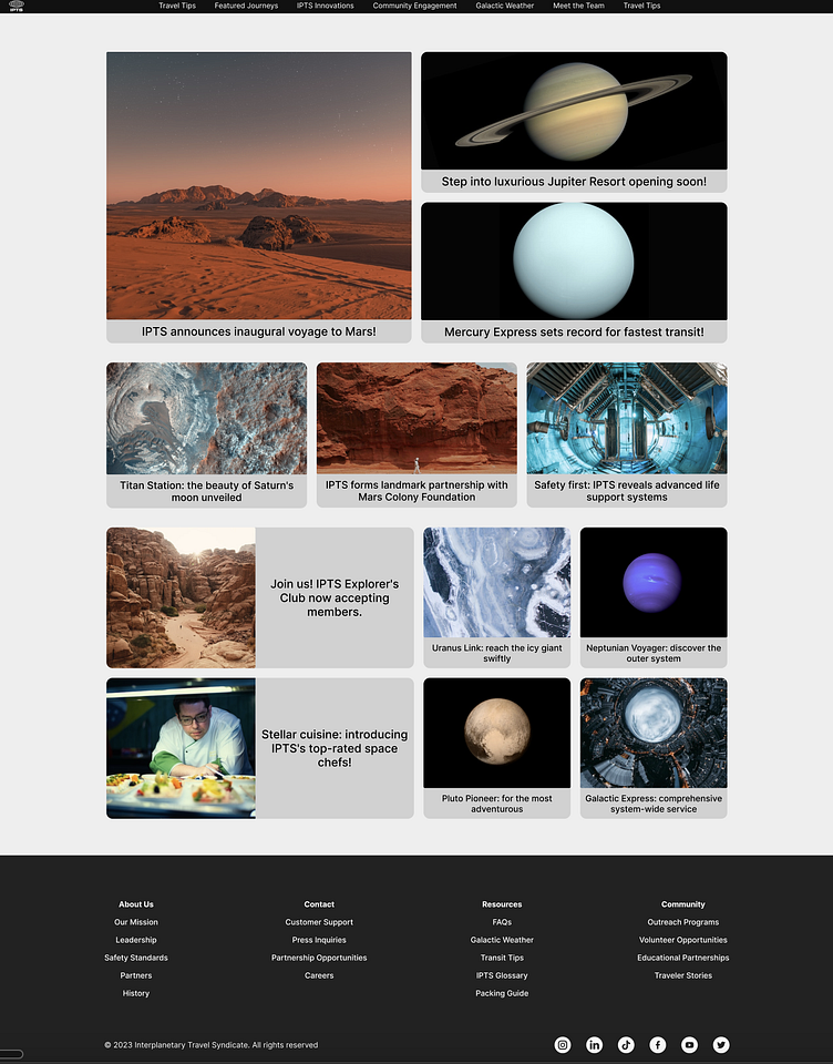
IPTS Hi-fidelity Wireframe (before rebrand)


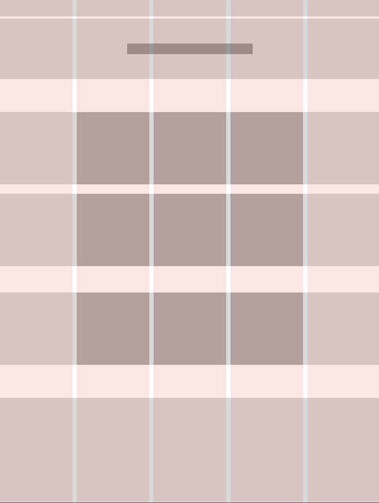
IPTS Design System

Phase I: Research and Design
Research
My research phase involved an in-depth examination of user-flows from existing platforms to shape my design approach. For Shuddle Visit (previously IPTS Travel), I incorporated features found in prominent travel booking platforms such as intuitive search functionality. For Shuddle Ride (formerly IPTS Rail), my design prioritized effortless navigation and clear comprehension of commute tracking.
Design
The design stage began with the translation of hand-drawn wireframes into high-definition digital illustrations on Figma. This project presented an opportunity for me to explore new areas like card component design, landing/marketing page layouts, grid structures, and news site layouts. Even though these areas were uncharted territories for me before the project, the learning journey was enriching.
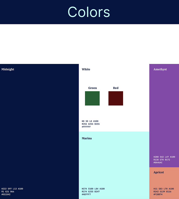
A significant part of the design process was the careful calibration of various design elements—color, border radius, drop shadow, font, and size—to convey brand identity at the fundamental component level. Each of these elements can be seen as different dials or levers that help shape the overall look and feel of a component, ultimately contributing to the brand's narrative.
I experimented with various color palettes to give each platform its unique identity while maintaining a cohesive visual language across all platforms. In order to create a flexible and reusable design system, I utilized grayscale colors in the component library, both in Figma and Storybook. This strategy ensured that the components could adapt to various visual contexts, demonstrating the power of flexibility in design systems. The grayscale components serve as a blank canvas, ready to come to life with color when implemented, thus providing a dynamic range for brand expression.
Benchmarking


Mockups
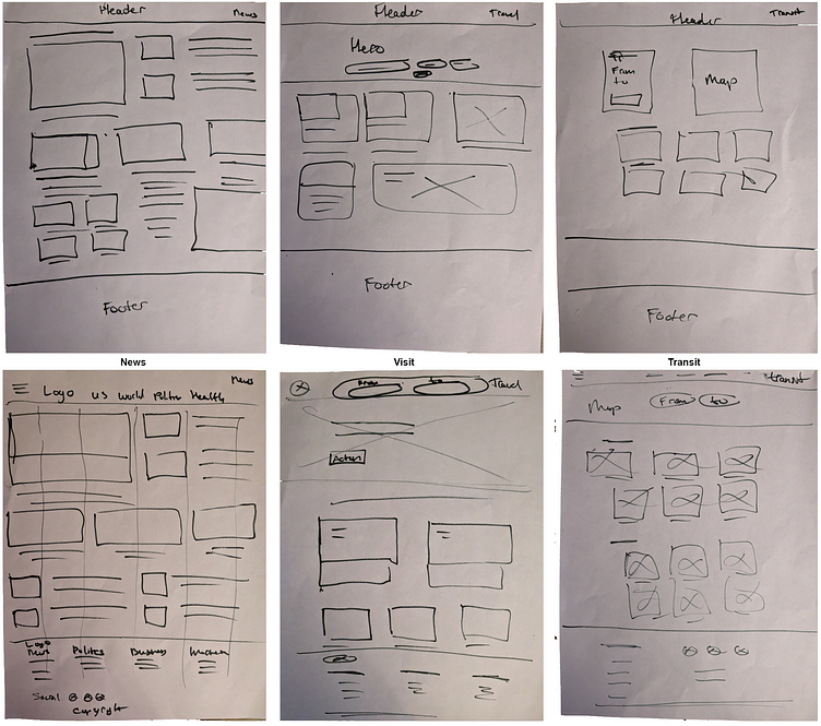
Low-fidelity wireframe


Phase II: Rebranding and Enhancing Components
Rebranding
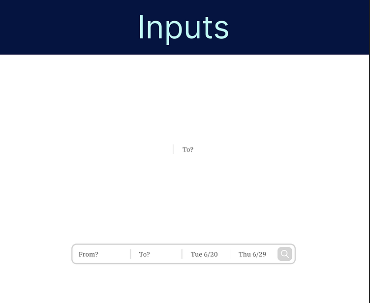
In this phase, I modernized the design, replacing simple input boxes with more advanced and visually appealing components. I also made sure to weave in the brand's youthful and energetic tone into the website and the style guide.
Enhancing Component Library and Storybook Integration
A significant part of the rebranding phase was improving and expanding the components, simultaneously creating Storybook components. This step improved the consistency and modularity of the designs and prepared the design system for future adaptability and implementation.
Shuddle Hi-fidelity Wireframe


Shuddle Design System


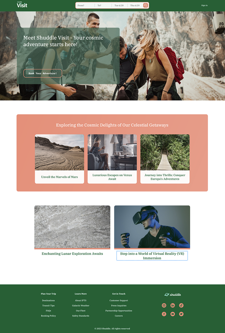
Shuddle Reference Site


Phase III: Implementation and Practical Challenges
From Storybook to Website
The journey from theoretical components in the Storybook to their practical implementation on the website was not always a straightforward one. I often found myself iterating between the two environments, tweaking component designs based on their real-world usage. This was particularly evident with the card components - modifications to their height, image positioning, and default alignments were made after testing them on the website.
Grid System and Responsiveness
Coding the grid system posed its own set of challenges. The objective was to translate the design grid into a code structure that was also responsive across different screen sizes. The complexity involved in achieving this served as a potent reminder of the importance of responsive design and its impact on user experience.
Embracing Styled-components
The styled-components library became a cornerstone in my development process. This CSS-in-JS library enabled a dynamic and powerful way to style React components, contributing to a streamlined workflow. With styled-components, the code became more maintainable and scalable, thanks to the ability to create reusable components with encapsulated styles.
Navigating the Class and Hooks Divide in React
A key aspect of this project was to find a balance between React Hooks and Class Components. Despite my preference for the simplicity of Hooks, the project called for a hybrid approach.
Finding Structure with Class Components
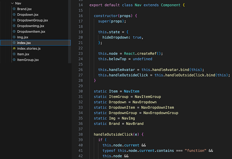
The need for an object-oriented structure in components made the use of Class Components essential. It played a crucial role in creating components like 'Nav', which housed nested child components such as 'Nav.Brand', 'Nav.Item', and 'Nav.Dropdown'.
Employing Hooks for Child Components
However, I managed to maintain my preference for the functional programming style of React Hooks by utilizing them in the child components. This blend of Class Components and Hooks resulted in a design system that was both flexible and dynamic.
Learning from the Trenches
Every coding challenge encountered during this phase was an opportunity to learn and grow. The experience of juggling between Hooks and Class Components not only expanded my React skills but also highlighted the importance of adaptability in front-end development. Regardless of personal coding preferences, it's crucial to use the tools that best serve the project's requirements and objectives.
Storybook (Navbar component)


Shuddle Website


Final Phase: Embracing AI Imagery
In the concluding stages of the project, I opted for a modern and inventive approach to enhance the visual appeal of the site. Leveraging the capabilities of generative AI via MidJourney, I replaced the existing imagery on the website with unique, AI-produced visuals. This avant-garde step further underscored the Shuddle brand's commitment to cutting-edge technology and innovation.
Outcomes and Next Steps
The completion of the first website marks a milestone in this journey. The components of the Shuddle design system were designed to be flexible and adaptable, which will expedite the creation of the remaining website.
The goal now is to package the design system into an npm library to enhance usability and integration. Furthermore, I aim to make the system a ready-to-use resource for future development endeavors, with the future sites planned for development adhering to the principles established in this first phase.
Reflections
This journey underlines the significance of an iterative process, balancing aesthetics with functionality, and maintaining a design system that effectively conveys the intended message. Looking ahead, my focus is on refining this evolved system, particularly concentrating on the rebranded Shuddle Ride platform.