Mobile banking app UX/UI design
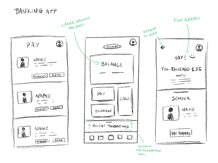
Initial sketch
I wanted to design a banking app with a focus usability and the aspects of such an app that are most useful to people.
Having a large bank balance view was my first goal. That became the centre-piece of the design and the jumping off point for everything else.
Wireframing
Building out how I want the design to look in more detail. Added in some icons for the menu.
High-fidelity build
Brought in colours, faces, some graphics. Went for a rounded-corners design. Overall, it's in the right direction but something about it wasn't quite exciting me...
.. So then I started over!
Initial sketch
This time around I went bigger and bolder on the balance view, giving it a larger section and allowing it to be the eye-catcher. I've shifted to putting nearly all of the focus on sending money between friends and family.
Wireframing
Building out my sections in more detail before committing to a full design. Through this process I found extra space for transactions and the keypad. Nice!
High-fidelity build
Added in colours and design elements as before, this time bringing in gradients to give it more of a modern feel, whilst retaining a focus on the pivotal aspects
Final shot for good measure
How do you think I've done? Would love to hear some feedback!


