Data Visualization Color Palette
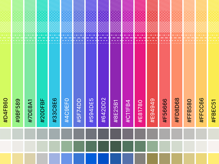
Tinkering this week with a palette better tailored for accessible data visualization. By creating a balanced spectrum you can get a good sense of what colors should and should not be used with each other.
Tinkering this week with a palette better tailored for accessible data visualization. By creating a balanced spectrum you can get a good sense of what colors should and should not be used with each other.