K+Renovation Logo
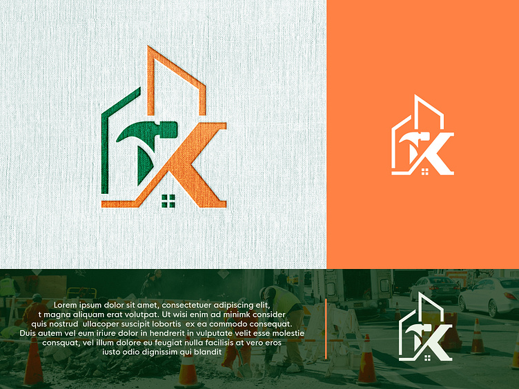
The K letter + hammer + renovation logo combines the elements of craftsmanship, strength, and transformation to create a powerful visual representation of a renovation or construction business.
The logo features a bold and stylized letter "K" as its centerpiece. The letter is designed with clean lines and sharp edges, representing precision and attention to detail in the renovation process. The strong and solid form of the letter conveys stability and reliability, reassuring clients that their projects are in capable hands.
Incorporated within the letter "K" is a hammer, an iconic symbol of construction and renovation work. The hammer is positioned in a way that seamlessly integrates with the curves and angles of the letter, emphasizing the synergy between the craftsmanship and the brand identity. It symbolizes strength, durability, and the ability to build and reshape spaces.
The overall color scheme of the logo is carefully chosen to evoke a sense of professionalism, trust, and modernity. Dark green is used to convey a sense of inspiration harmony and safety while a touch of orange or yellow could add energy and vibrancy to the design.
This K letter + hammer + renovation logo captures the essence of the business it represents – a company dedicated to providing high-quality renovations, construction services, and a commitment to excellence. It communicates expertise, reliability, and a focus on delivering transformative results for clients' spaces.


