Website for Relocation and Immigration Services Company
🌍 ProRelo – Your Partner for Immigration and Relocation Services
ProRelo is the partner of choice for immigration and relocation services in Poland and Slovakia. They cater to corporate clients, global mobility partners, and private individuals, offering comprehensive solutions to navigate the complexities of relocation, ensuring a seamless transition for clients moving across borders.

💡 Workshops: A Crucial Phase of a Well-Thought-Out Product
The goal was to design a website that aligns with ProRelo's new branding guidelines, including typography, colors, line illustrations, and photos. As part of a larger rebranding project, the website needed to serve as a cohesive and consistent representation of the brand across various channels, ensuring that the visual identity is unified and impactful across all touchpoints.


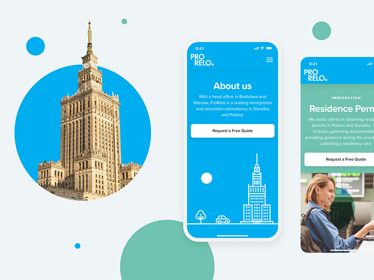
📸 Photography and Circles in Harmony
Our design incorporates images with circles floating upwards, using the multiply blending mode to create a unique visual effect. Some of the images feature splashes of color, and the circles seamlessly blend into the scene, becoming an integral part of the composition. This harmonious fusion of photography and geometric elements adds depth and dynamism to the overall design, reflecting the brand's modern and creative identity.

🎯 Making Users Feel Comfortable, Engaged, and Inspired
The final design had to offer a cohesive look and feel that truly reflects the brand identity while remaining visually appealing. Given that the majority of page views come from desktop devices, ensuring the page looked exceptionally good across a variety of screen sizes and resolutions was crucial.
Additionally, the website needed to be easy to manage and update for the client, without compromising on the personalized design. This included incorporating animations on the main page to enhance user engagement and create an inspiring experience that keeps visitors connected and motivated.

🎨 ProRelo's Guidelines as a Design Foundation
ProRelo's branding guidelines served as the starting point for designing line illustrations, photos, and other creative elements. A signature design feature you’ll frequently notice are floating circles in our illustrations. These circles typically use the multiply blend mode for transparency, except when they are white, adding depth and visual interest to the design while maintaining brand consistency.


📞 Contact Page
Given that the client serves customers in two countries, it was essential to design a contact page that makes it as easy as possible for web visitors to navigate the contact form. We focused on clear, intuitive design elements to ensure users could quickly find the information they needed and easily get in touch, regardless of their location.