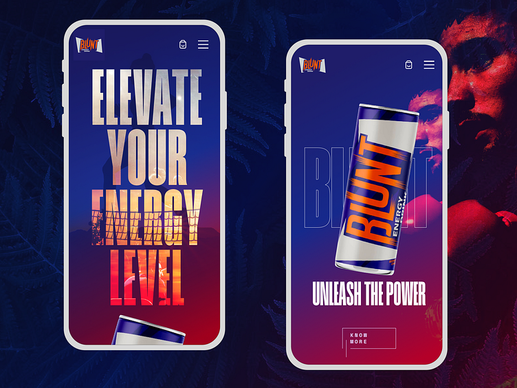
Mobile UI Design: Blunt Energy Drink
The main focus of the design was to make it more energetic as the concept is for an Energy drink and the brand attributes of the same should be showcased within the design.
The only problem that the design needed to solve was that the brand communication which is mostly around energy should stand out in the design.
Let me know in the comments how the design has shaped up.
To achieve this design i have taken inspiration from other energy drink brands as well as from Footwear brands. Adventurous and Energy were the brand keywords that were mostly targeted.
More by eu4rik View profile
Like
