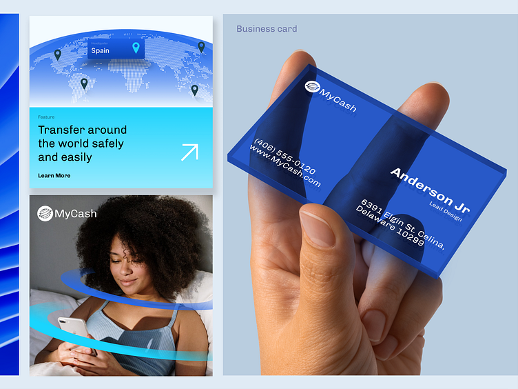
MyCash-Visual Identity
Hi Folks!
Logo Exploration for MyCash, playing with negative space to show a circle in the brandmark. Let me know what you think.
What do you think about Shot?
Also, Follow my Instagram for other cool stuff Makruf al hafiz
Feel free to leave comments and feedback. Thanks!
-----------------------
Wanna collaborate with us? Shoot your business inquiry to [email protected]
More by Plainthing Studio View profile
Like


