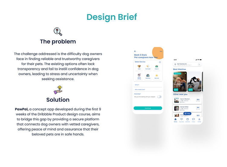
PawPal - Empowering Trust and Control -Dog Walking App

Unveiling Insights from Key Competitors
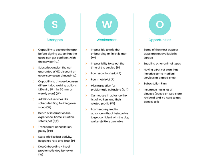
I conducted comprehensive market research, analyzing some of the leading competitors in the industry, Rover, Wag!, and PawShake. I examined their services, platforms, and features, and carefully evaluated their strengths, weaknesses, and opportunities to gain valuable insights into the market landscape.

Nurturing Trust and Control: User Flow Tailored for Cautious Users
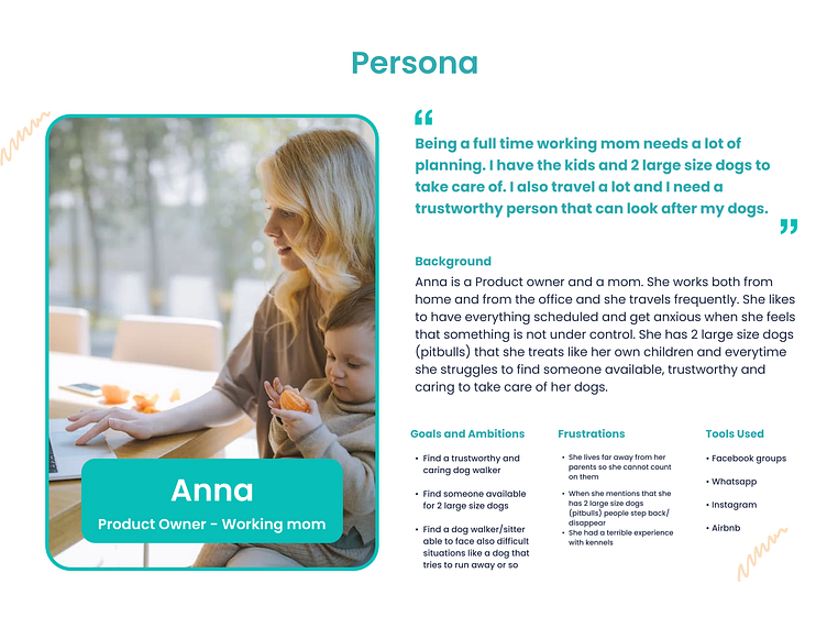
Based on the insights from user and market research, I developed a user flow that caters to the needs of cautious users like Anna. Anna values having control and trust in the app, so she can explore the available caregivers and gather extensive information before committing. To accommodate this, the app allows users to browse without signing up, with the registration process required during the booking phase to ensure a seamless experience.
Translating User Needs into Intuitive App Flows
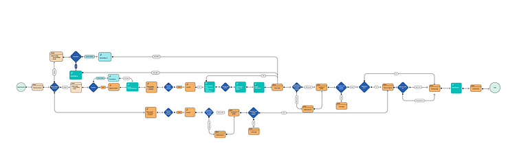
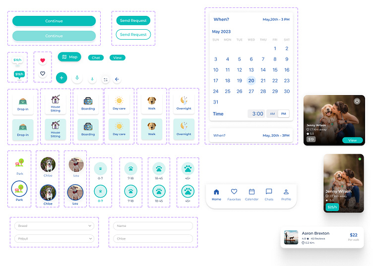
In the wireframes section of the case study, I translated the identified user needs into visual representations. The objective was to illustrate the key app flows and demonstrate how the user requirements were addressed. By creating these wireframes, I aimed to provide a clear and intuitive overview of the app's main functionalities and interactions.
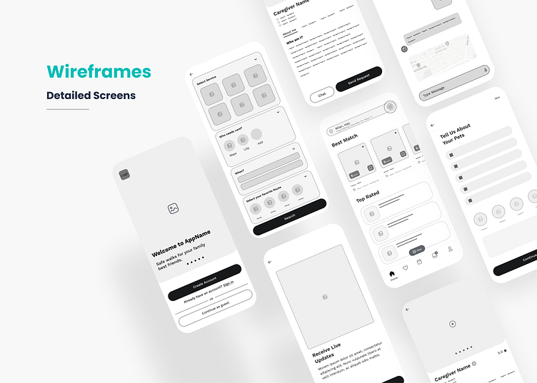
Visual exploration
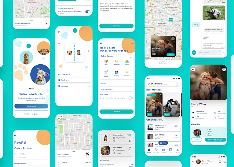
Onboarding
Booking a caregiver
Live updates
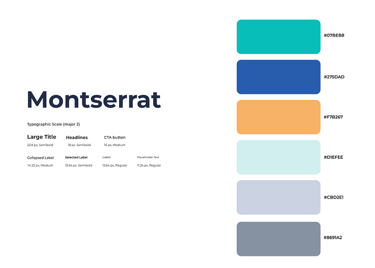
Color Psychology: Crafting an Emotionally Engaging User Experience
I carefully selected colors for the app based on the psychology of colors. Shades of blue and blue-green were chosen to evoke feelings of trust, calmness, and reliability. Additionally, vibrant hues like orange were incorporated to infuse a sense of happiness and positivity. These color choices were made with the intention of creating an overall user experience that feels trustworthy, soothing, and joyful.
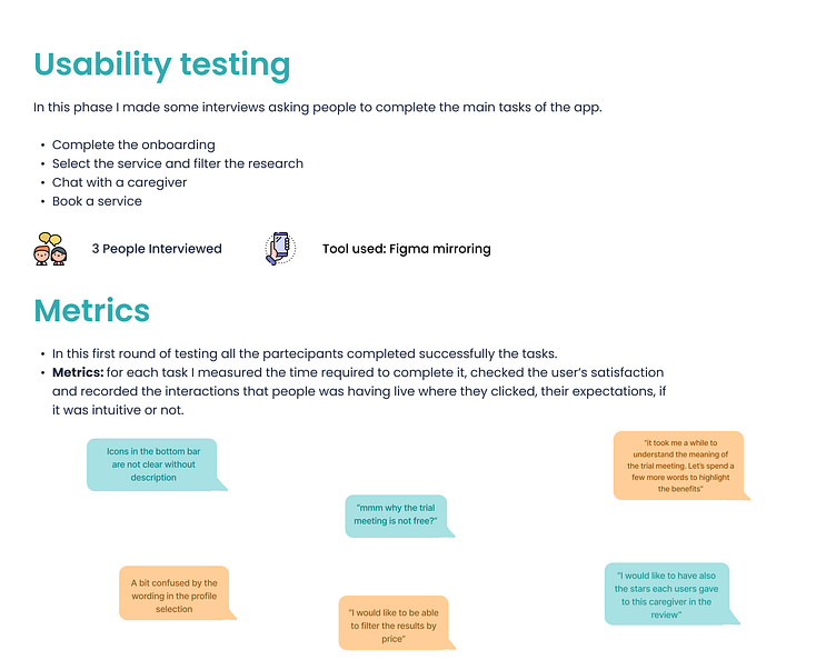
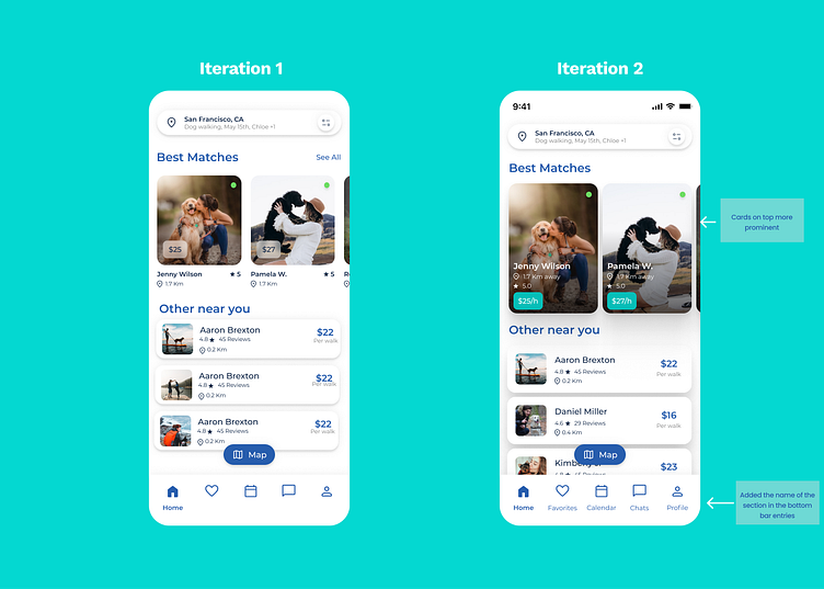
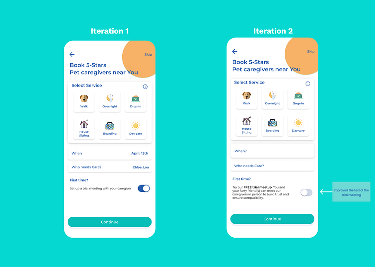
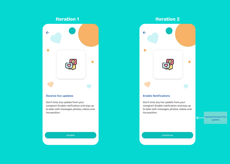
Enhancing User Experience: Implementing Feedback-driven Improvements
Based on the feedbacks received during the interviews I applied the following improvements:
Fix the wording to make the UX more clear and straightforward
Fix the UI where it’s not clear
Add a filter in the home page to let the user order the results in the way that fits better for them
Fix the Trust issue that the payment of the trial meeting is giving Explicitate the benefits of the trial meeting