Interface design concept for a Payoneer fintech app | Lazarev.
WSP, fam!
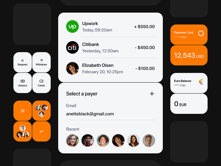
We’re excited to present our last shot with the design concept for a world-known FinTech platform, Payoneer 📱
We’ve employed the combination of black and orange, creating a sense of energy and movement on the page. The strategic use of white space along with big, visually striking icons and buttons ensure a clean and uncluttered layout, guiding the user's eye to the most critical elements. The typography is modern and easy-to-read, providing both elegance and functionality.
We couldn’t resist the temptation to play around with the FinTech logo. With its multiple colors merging with each other, it gives the product a fresh and bold new identity.
So, how do you love this updated interface design? Hit us up with your feedback.
PS: Hey, Payoneer guys, this is your last chance to get in touch with us to start the ball rolling on a real app redesign. Here is our contact details:
Empower your project with an award-winning team 🚀
