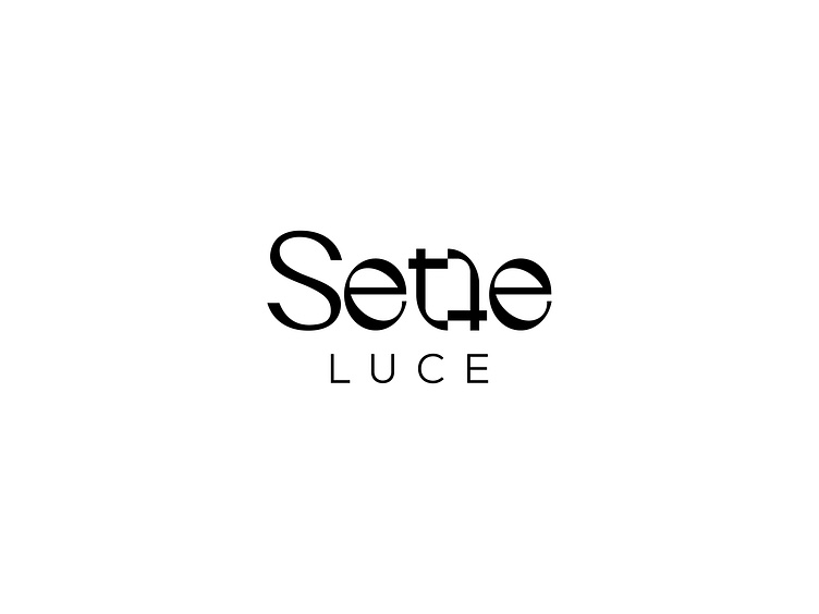
Sette Luce Logo Design - Version 1
First version I made for the client. Since the brand name comes from italian language where sette means seven, I played with the letter "t" in order to make it look as the number 7 which also got to create a unique shape that can be used as an icon in certain situations of the brand.
The logo style is feminine, minimal and playful.
More by Romina View profile
Like

