Radical Health | Logo Design

We wanted the logo to stand apart from traditional health-tech brands and highlight Radical Health’s personality.
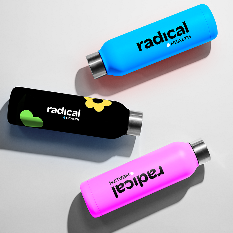
We chose a new brand font, Adieu, and incorporated an upside-down “i” that turned into a “!” to bring emphasis to the importance of their mission. The brand colors are bold and vibrant to reflect the community and are inspired by Bronx street art. We also leaned into a circle as a primary graphic element to highlight RH’s foundation in circle practices.
See full project at clairecassreino.com/radical-health