Haloskin Logo

Hey Dribbblers 🙌
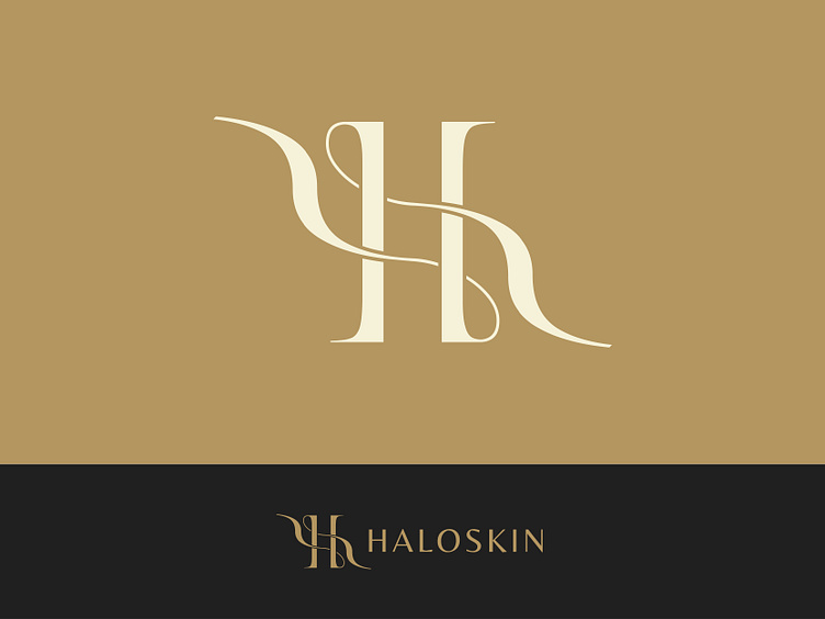
The letter "H" in the Haloskin logo represents strength, sophistication, and elegance in a remarkable way. The letter's layout was thoughtfully chosen to reflect the key principles and goals of the company.
The "H" is sleek and streamlined, with clean lines and balanced proportions. It exudes a sense of stability and confidence, reflecting HaloSkin's commitment to providing reliable and effective solutions for skin protection and care.
Exclusive logo on:
Other market from us:
freepik | creativemarket | designbundles | creativefabrica
Find Us on:
Contact us to get your logo design or branding project done
Email: [email protected]
© 2023 Rukurustudio | All Rights Reserved.