Crypto currency bank App - Bitfold


Project overview (TL;DR)
Design brief
Bitfold is a crypto currency app where you can manage and follow your currency wallet. The research shows that users are not particularly familiar with crypto currency in general and need a simple app to start with.
Work and result
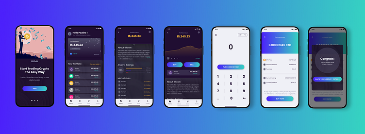
mobile app with a Iphone 13 pro on Figma
7 views: onboarding (with 3 steps), dashboard, coin details (details active and inactive), buy coin screen, buy review and buy confirmation
a functional prototype
a UI library.
My Role: UI/ UX Design
Time: 1 week
Mission: Project as part of the Dribbble Product Design Course (May 2023)
Research
The customer interviewed his users to define their profile and expectations. They are not familiar with tech in general but they want to start with crypto currency, get some advices and help.
Key Insights
zf
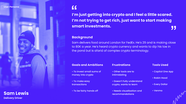
User persona
The profile is very new with crypto currency and he is just looking for fun and smart choices. No need a complicated app for him, he just needs to reach the main features easily. He doesn't want to be rich but he wants to learn this new topic. He is not a techie though.
User flow
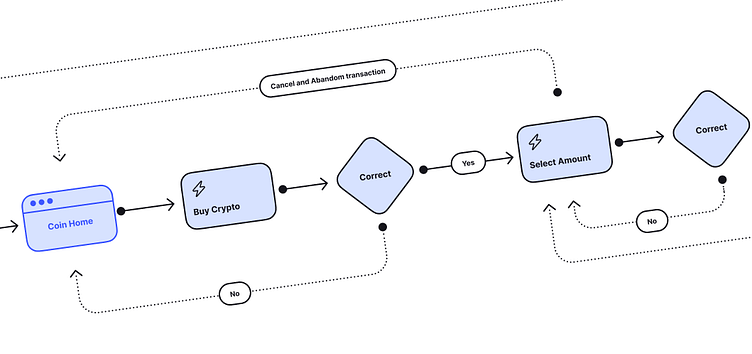
The customer gave me his insights regarding his app. He worked on an user flow based after his research. I received the details to buy a currency.
It had:
4 views: wallet, portfolio details and select an amount and confirmation
3 decisions: buy a currency, select an amount, confirmation
Designed flow
I created views to represent 3 main flows: the onboarding, the portfolio navigation and buying a currency.
I extend the design to fit with a more realistic process while designing an app. I didn't design the entire app with all the view. I could add the account settings, the account creation, view when the app is empty and many other flows.
Moodboards
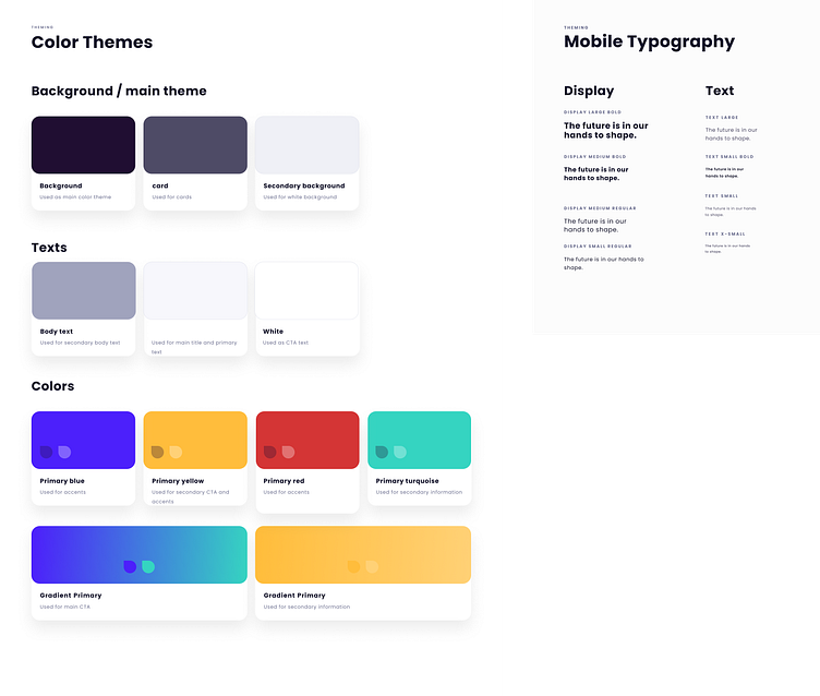
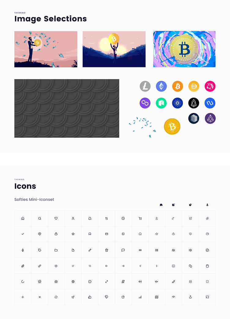
In order to fit the expectations and follow the specificities for crypto, I created a moodboard with the colors and style that matched with the target audience and what has been accepted by the client. I used a glassmorphism inspiration with dark colors, gradients and transparency to provide a serious feeling.

Wireframe
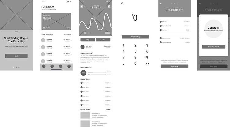
The wireframe has been provided by the customer.
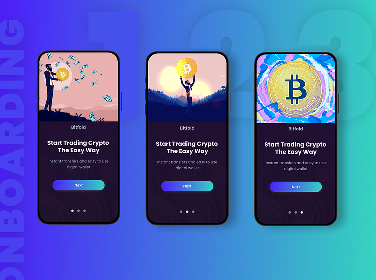
1: onboarding screen. Small circle suggest it should be 3 screens for the onboarding so I made 3 of them with interaction. It's a very simple one with no explanation of the app. It could be interesting to improve the app and create a strong and complete onboarding with feature and screen explanation
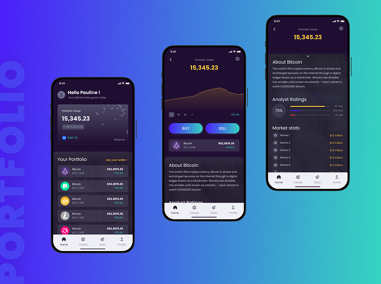
2: home. Quick overview of our portfolio and its value. There are also all our crypto currency below with individual values. I added shortcuts to sell and buy.
3: crypto details. Overview of the values and stats.
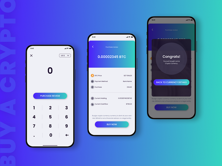
4: select an amount. A simple screen to select an amount.
5: Preview. A sum up of all information before the purchase.
6: A confirmation view as overlay after the purchase.
Design and UI library
I started working on the design after the wireframe and the artistic direction we agreed previously with the customer.
I created his own design and added a smooth background to provide texture and improve the experience. Thanks to this background, I also wanted to give a premium feeling.
I created UI library and component while designing to make the development easier. It also helped me to apply the exact same font, sizes, components and keep consistency.

Prototype
I needed prototype on Figma to create micro interactions on the app and confirm them with the customer.
We also selected the phone frame to test the prototype as a real app.
I tested a flow with users to improve the UX and UI. I wanted to confirm the onboarding and buying a crypto flows. Their feedback helped me to improve my micro interactions on the app to make it more intuitive. As the users are new, I was looking for tips to create a very simple app for beginners.
Figma prototype
Below you can see the construction of the prototype for the app.

Onboarding
Below the video show you the onboarding steps when the user is opening the app for the first time.
Portfolio
The video shows the portfolio flow where a user can navigate on his home, see his portfolio and see details on his crypto currency.
Buy a crypto currency
Below you have the flow to buy a crypto currency. I created 2 ways: a big specific CTA from the crypto details page (first video) and one shortcut from the home directly (seconde image).

Next step together?
Summary
Thank you for watching this case study.
With this project I spent qualitative time working on the design itself as I absolutely needed to create something easy for beginners. The main challenge here was to conjugate the huge quantity of information we have when we deals with crypto currency with a simple design.
Contact
If you are interested about my work, I will post and update the new projects I used to work on and the ones I'm currently doing.
If you want to work with me, don't hesitate to contact me on LinkedIn.