DEGIRO - Logo Redesign Concept v2
DEGIRO - Logo Redesign Concept v2
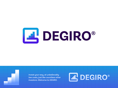
Invest your way, at unbelievably low costs, just like countless other investors. Welcome to DEGIRO.
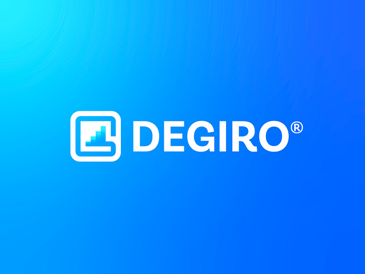
Concept idea I had for this Dutch company called DEGIRO (de Giro). I wanted to create a letter G with reference to bars, growth, stocks, and personal wallet. As for their current logo, I often felt dull, and too uninspired, this little growth bar felt like an interesting approach.
Happy to hear your thoughts. See their current logo here.
Hit L to support!
___________________________________________________________________________________
___________________________________________________________________________________
Let's work together and elevate your brand! 🚀
Feel free to reach out via Dribbble DM or E-mail:
👉 [email protected]
💼 Connect with me on LinkedIn / Read my Client Recommendations
🎬 Check my YouTube for Logo Tutorials / Learn Logo Design
🔗 Follow me on Instagram / See BTS and New Content
🛒 Buy my pre-made or unused logos from the portfolio
💬 Tweet with me