Dividend Life – Logo Design

Logo for investing blog where people learn how to invest in stocks. The task was to create a simple, minimal, trustworthy, and professional-looking logo.
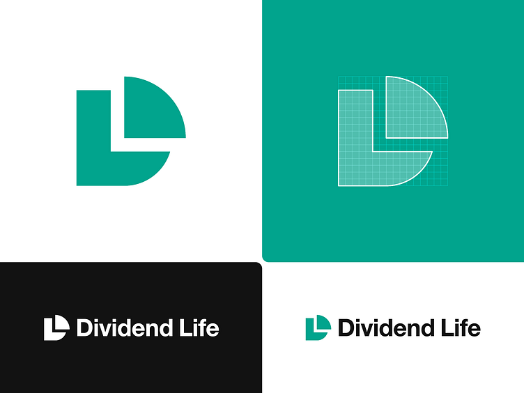
The created logo consists of the letter D and a cut piece that creates a letter L in negative space. Also, the concept reminds a pie chart that nicely conveys the idea of investing.
Press L to like this post 💜
Let's work together on your project!
Send an email to → [email protected]