Fearless Minds
Visual identity and website for TV production company
Fearless Minds needed a refreshed identity and a website to go with it. They felt their existing identity was too corporate and didn’t have enough standout in the expanding market of independent TV production companies.
The new identity had to be relatively simple, owing to the evocative name and its literary origins (the phrase “fearless minds climb soonest unto crowns” is a line from Henry VI Pt. II). The challenge was to give a nod to this, whilst not being too literal or drawing attention to the drama inherent in the name. It also had to encapsulate the spirit of an independent production company, whilst avoiding twee, cutesy cliché.
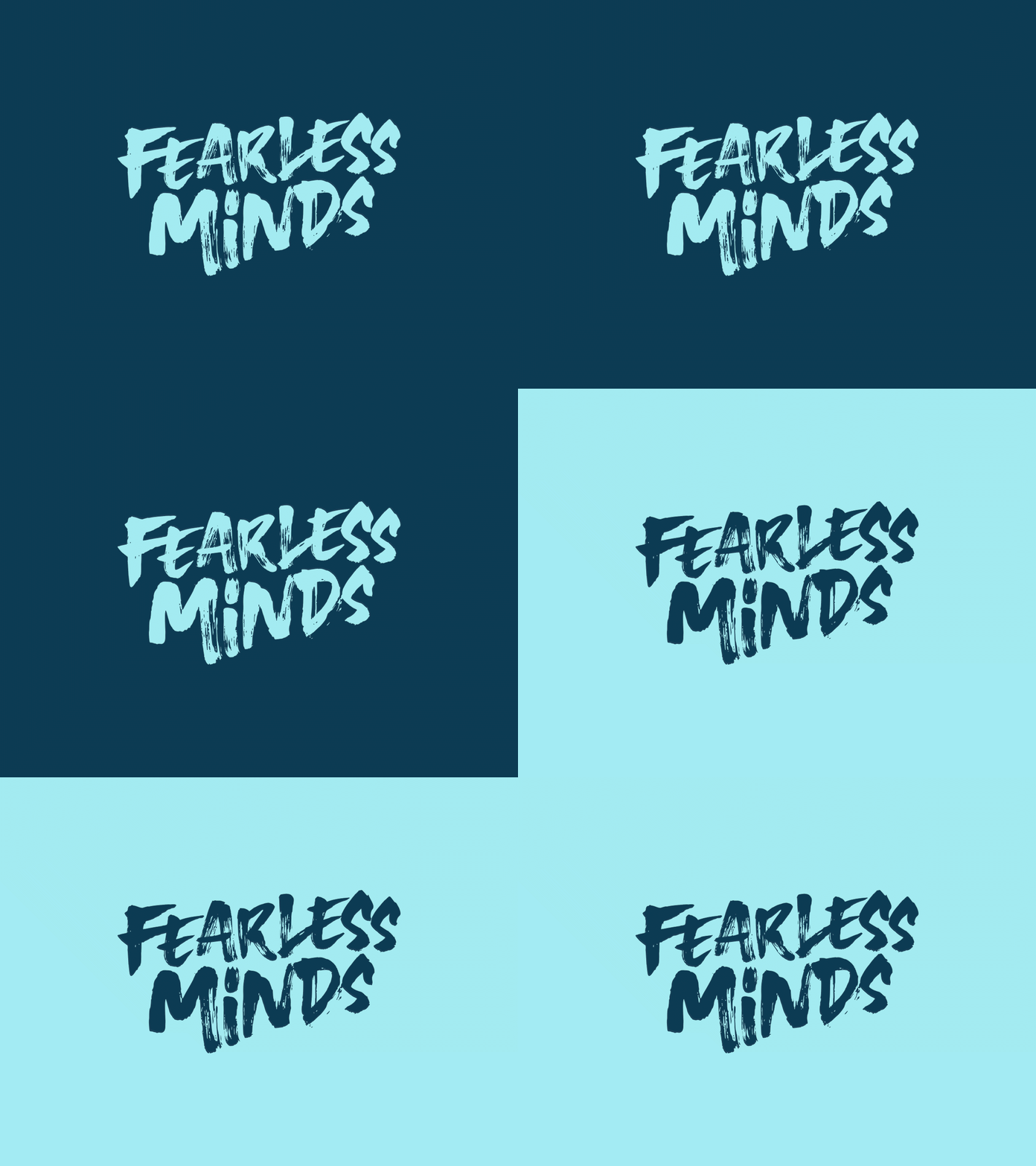
The final identity uses bold brush strokes to render the name as if rapidly daubed on a wall. Detailed, messy brush strokes tapering to the right were used to give it energy and direction. The dot on the i is subtly customised to suggest a character’s head wearing a crown. It’s not obvious, but it rewards a closer inspection as well as providing a characterful asset for brand collateral.
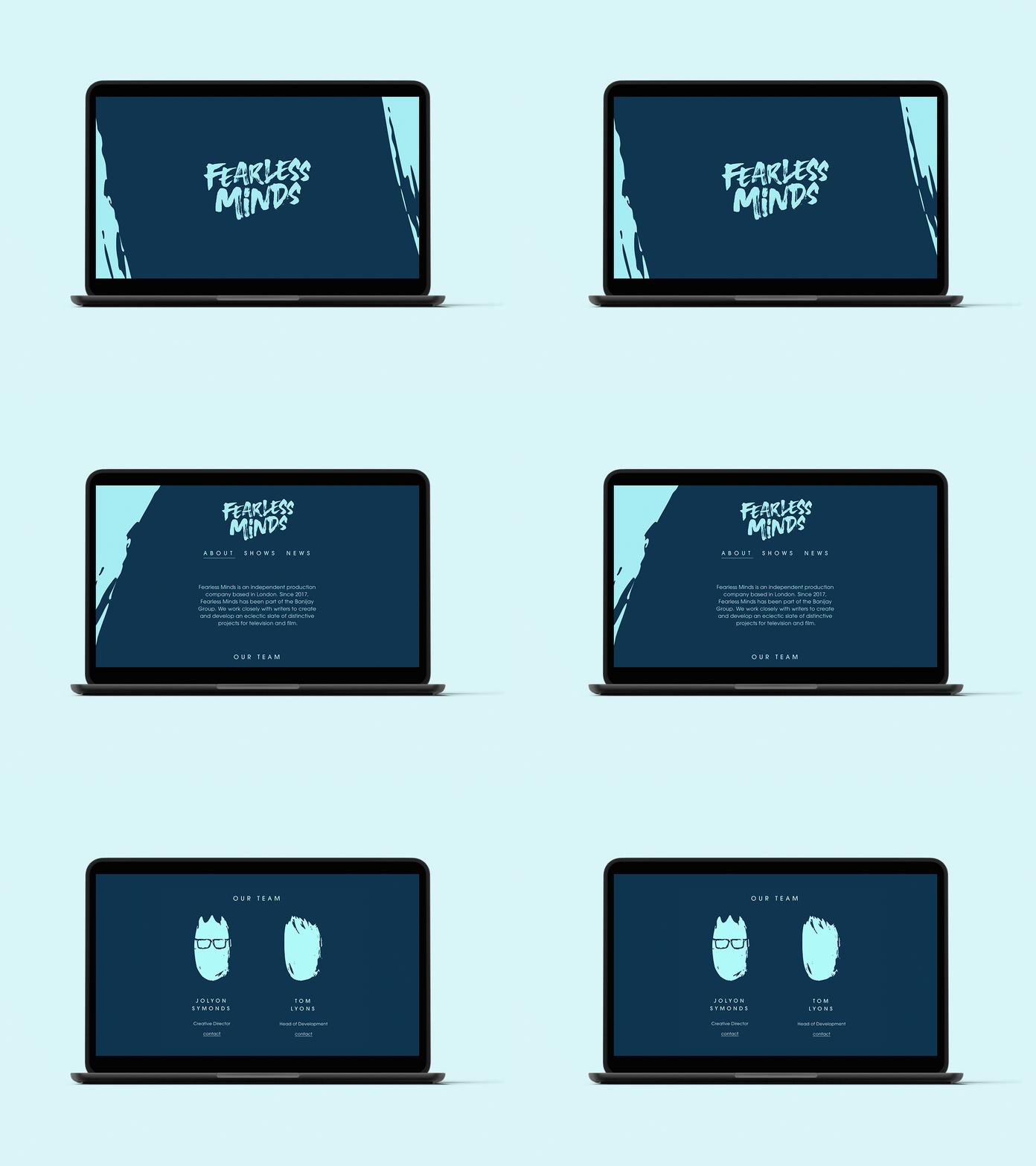
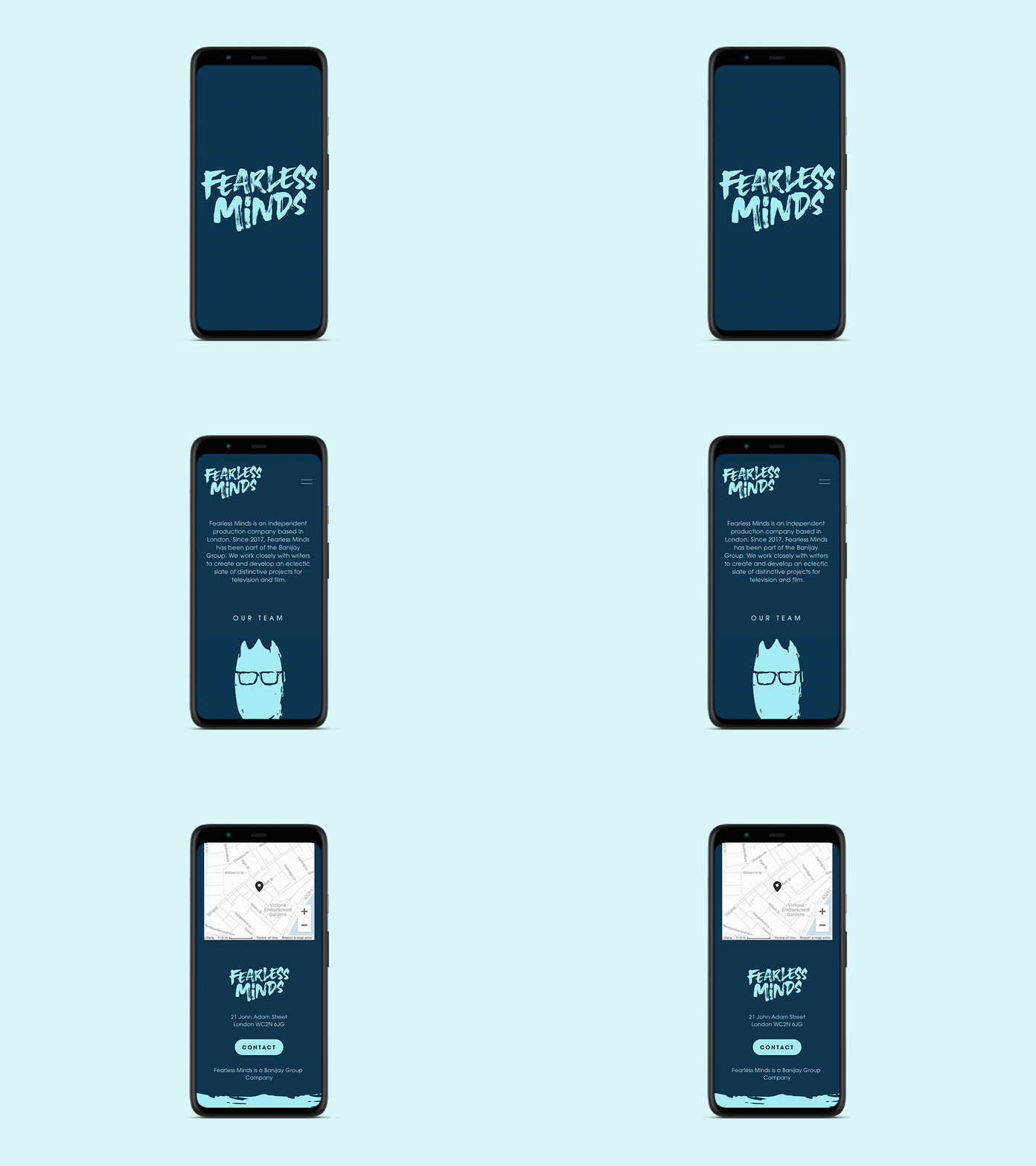
The website had to be simple and to the point, acting primarily as the first point of contact with prospective writers. It couldn’t rely on production imagery, so I employed a clean, graphic style across the site, using the motif of the bold brush stroke to tie the site back to the identity. The ‘crowned head’ element from the identity was adapted to represent members of the company in the ‘team’ section.


