Bringing Notice to Life: The UX/UI Design Process Behind the Lan
A Stimulating Challenge: Designing for Simplicity and Speed
Introducing 'Notice', an innovative platform centered around web content creation. My challenge: to design a landing page that embodies Notice's vision of simplicity, speed, and flexibility
Immersing in User Culture
The crucial first step of this project was user research. By immersing myself in the startup's culture and closely collaborating with the Notice team, I was able to understand the users' needs and expectations, which guided the UX strategy for the landing page.

Turning Ideas into Actions
Upon defining the user goals, I transitioned into the ideation phase, sketching initial concepts and crafting wireframes. The goal was to create a seamless user journey that aligns with Notice's mission of ease and speed.
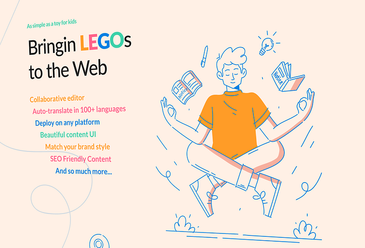
Balancing Function and Form
In the UI design phase, I utilized a pastel beige and orange palette to create a sense of serenity and simplicity, while bright secondary colors were used to emphasize key features. Each design decision was underpinned by Notice's values, with line drawings and 'Lego' block elements reinforcing the idea of uncomplicated, creative building.

A Landing Page that Speaks Volumes
The final product is a user-centric, visually engaging landing page that truly represents Notice. The journey from understanding the startup's culture to designing a product that enhances user experience was immensely rewarding. Reflecting on this process, it reinforces the power of empathetic, user-focused design.
❤️✨ Press "L" if you like it ✨❤️
⛩ ✨ ⛩
Designed on Figma & Illustrator
by Thibaut MÉLEN
⛩ ✨ ⛩
