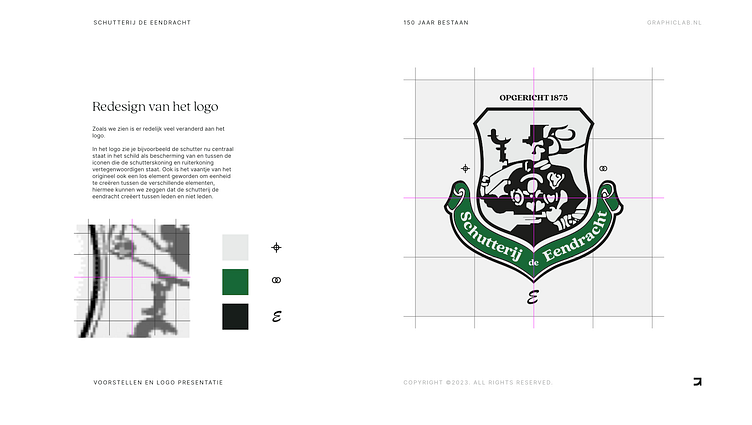
Redesigning a 148 year logo.

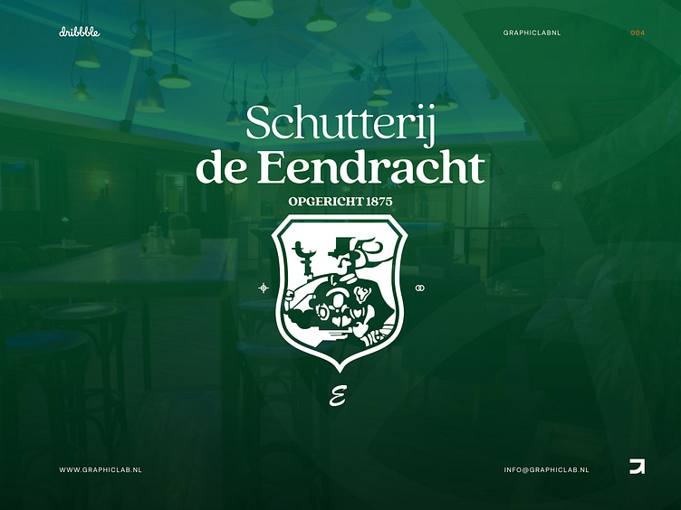
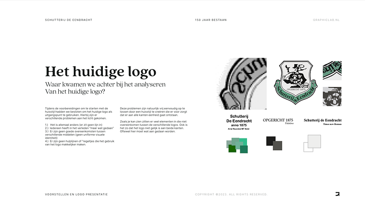
For this assignment we were tasked with redesigning a 100+ year old logo. The old logo was re-used and re-rasterized to many time's and with the upcoming 150 year anniversary of this association they wanted to have a "new" logo to make it future proof.
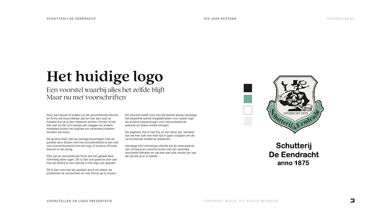
Keeping the heritage and improving the logo
Whilst it is easy for us designers to go above and beyond in making a new logo future proof, it was important to stay close to the original vision of the logo. The new logo should also improve the usability but not throw away too much of the original details.
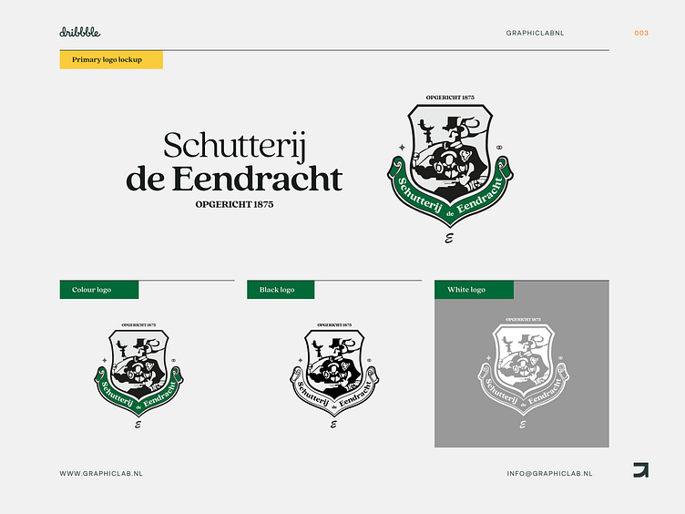
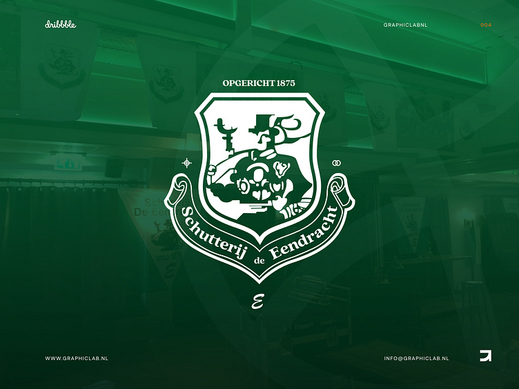
We selected a new font to clean it up. The original which used more than three just in the logo itself. We cleaned up the colors for broader use and ease of matching with offline items like flags, banners and clothing.
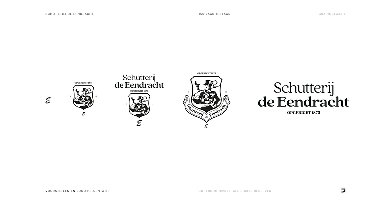
The logo is made to fit many compositions and function in multiple ways so it can work with many use cases.
Interested in partnering with us?
Get in touch at [email protected] or visit our website graphiclab.nl.
Follow our updates on: