Case Study: Redesigning the UI for a Campgrounds Website

Overview
As a personal challenge, I decided to re-design the UI for the Thousand Trails website. I wanted to keep the structure, functionality and content mostly the same while refreshing the visual design.
For this project, I chose to use a site I had personally used and struggled with in the past. Thousand Trails is a membership campground company operating private trailer park and campground resorts in the United States and Canada.
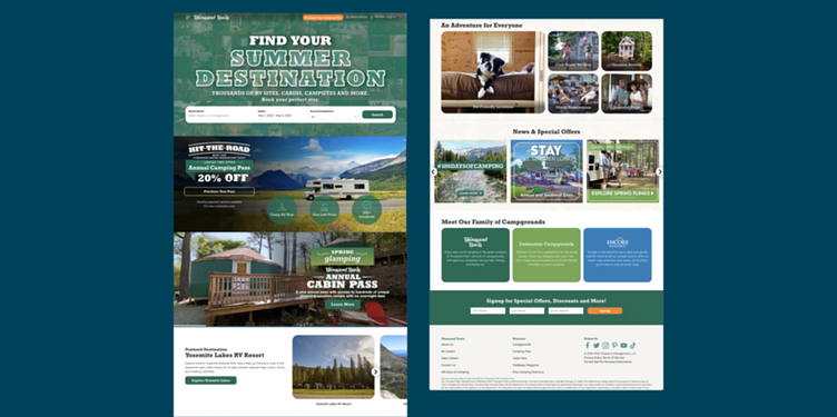
The Original Site
I studied the original site, and immediately found several challenges I wanted to tackle in this project.
• Inconsistent font usage
• Visually overwhelming
• The photos are sometimes pixelated and low quality
• Unclear hierarchy in some areas

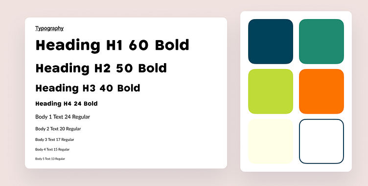
Moodboard and Style Guide
I created a moodboard to explore the visuals and colors I wanted to use, as well as the vibes I wanted to express. I also wanted to explore some aspects of neubrutalism, an interesting challenge that would lend itself well to this website.
I then created the style guide. I wanted to use bright, bold colors, and focused on greens plus a different accent color. The orange lent itself nicely to this.
For typography, I chose Katahdin Round, a font that's named after a mountain in Maine, and what better font to use for a camping site than this! To accompany it, I used Lato, a clean and slightly round sans-serif.
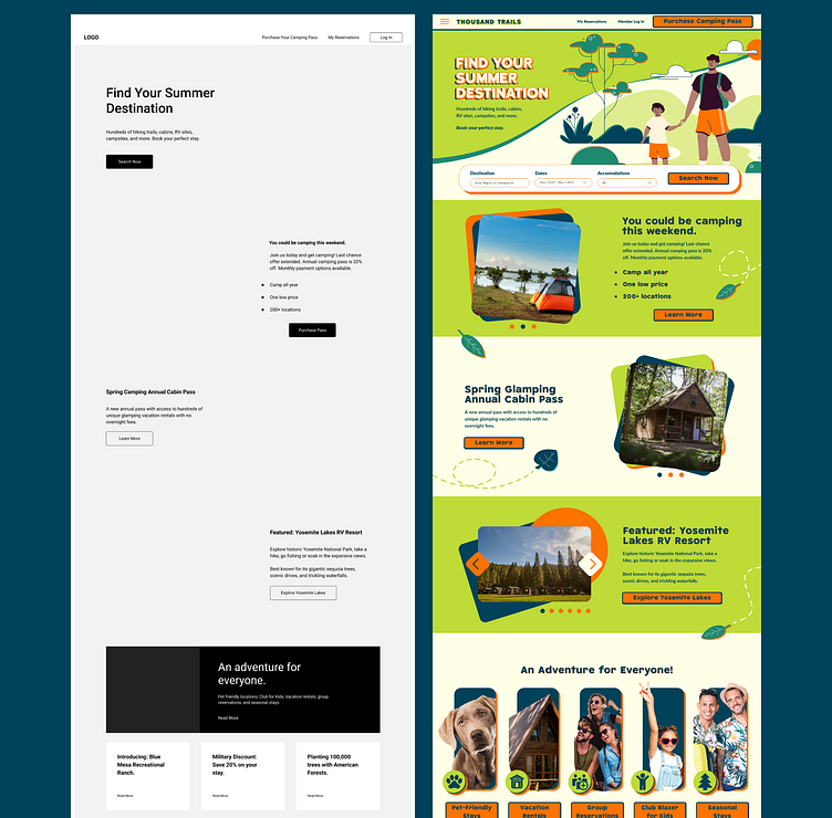
Wireframe and Components
I created a simple wireframe using Figma's wireframing kit. Using this and the structure of the original site, I had enough guidance to create the mockup. I also designed components such as buttons and photo carousels, and added relevant icons.
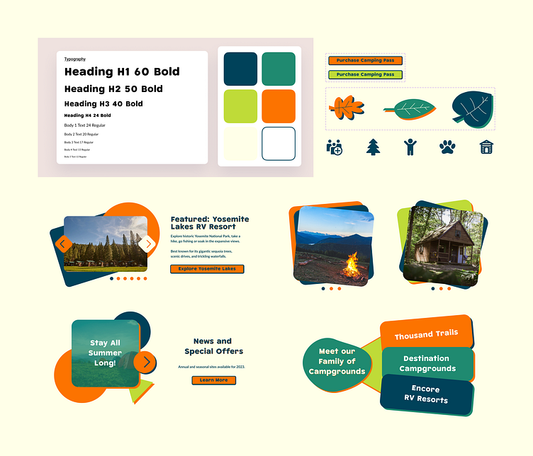
Prototype
Finally, I created a simple prototype. Take note of some minor changes I made to the original design while working on the UI:
• Updated the logo to fit the new color palette
• Combined "First name" and "Last name" fields into simply "Name"
• Moved the CTA button in the header to the upper right corner
• Updated some photos to higher quality photos and used imagery of younger people as well as families to draw in younger customers
• Added illustrations to accent the photos (hero and CTA section illustrations are from drawkit, I created the accent leaf illustrations myself)
The final design can be seen in Figma here.
Takeaways
This was a fun project to work on and I enjoyed practicing the process of working from an existing site. I'm excited to continue developing my UI methods and skills further.
During this project, I also had a ton of fun working with neubrutalism. Since I didn't use the bold blacks typical of neubrutalism and replaced it with dark green instead, I'd like to try a neubrutalism project that does use black in the future.
You made it to the end! Thanks for reading and hope you enjoyed it! If you liked this, please check out my other work here on dribbble and feel free to connect with me on LinkedIn.
