WEBSITE - Premium Events & Design
THE CONTEXT
Mariama Taj, the founder of Premium Events and Design in Vancouver, Canada hired our team of 3 to help design phase 1 of her project in development, FOREVER DREAM WEDDING.
The Forever Dream Wedding event will be a sustainable annual wedding event hosted by Premium Events and Design. Ms. Taj aims to reduce waste without compromising the aesthetic of weddings.
In order to make this a reality Ms. Taj will need to recruit 100 couples who have had a destination wedding and are willing to talk about their experience in a one on one interview.
THE PROBLEM
The Forever Dream Wedding project is in the research phase and estimated to launch in approximately 2 years.
Ms. Taj asked us to evaluate successful “marketing research campaigns', annotate elements that were used to captivate users and likely to increase conversion rates. This research will be referenced when designing a landing page for the Forever Dream Wedding research page.
The Forever Dream Wedding landing page will be used to recruit 100 couples who have had a destination wedding to interview one-on-one with Ms. Taj’s team.
THE RESEARCH


PFIZER
Clinical research sites are effective in convincing users to sign up to be contacted.
I chose a Pfizer clinical research page to annotate its components and identify which are the most successful and why.
The Pfizer site had a strong mission written in large bold text, with a strong empathetic hero adjacent to it.
The CTA button was present throughout the entire user journey making it simple for users to convert at any stage.
The site had a large amount of white space and condensed text by including summary boxes that also served to add dimension.
The Pfizer page is a great example of a successful “marketing research campaign” and Ms. Taj agreed that this design should be referenced as inspiration when designing the Forever Dream Wedding lading page.
EMPATHISE

Gabe and Angelica live in Seattle, Washington. The couple celebrated their wedding in Nayarit, Mexico last summer.
Angelica wants to inspire other couples looking to have a beachfront destination wedding. Angelica created a board on Pinterest and posts regularly on Instagram using hashtags like #destinationwedding #summerwedding #mexicowedding #nayarit, etc. Angelica and Gbe enjoy sharing their experience with friends, colleagues, and family.
The Forever Dream Wedding team finds Angelica’s posts through social listening technology. Angelica begins to see posts on her social media platform advertising a research study about destination weddings, hosted by Premium Design and Events. The study offers compensation in exchange for a 1 hour interview.
Angelica proceeds to follow the link to the research landing page for the Forever Dream Wedding project hosted by Premium Design and Events. Angelica scans the page and decides to sign up to be contacted to set up and interview.
DEFINE
In order to plan a sustainable destination wedding event, Ms. Taj needs to interview couples who have planned and executed a destination wedding. Ms. Taj wants to understand the challenges and costs involved in planning a destination wedding. The Forever Dream Wedding landing page should target participants who fit the following criteria:
Couples who have had a destination wedding
Couples who live in the US or Canada
Inclusive relationships

The biggest challenge that Ms. Taj will face is finding couples like Angelica and Gabe, user persona. SOCIAL LISTENING technology like Brandwatch will allow Ms. Taj to target users like Angelica and Gabe who enjoy sharing details about their destination wedding on social platforms. If users enjoy talking about their wedding on social platforms, they are more likely to click the Forever Dream Wedding research advertisement and convert this interaction into a 1 hour interview.
Ms. Taj would like to track conversion rates and see what components on the landing page work best. Resources that can help Ms. Taj gather this data are Hot Jar and A/B testing.
The Forever Dream Wedding landing page can attract bots which will generate false leads for Ms. Taj. In order to reduce this occurrence we recommended that Ms. Taj embed a reCAPTCHA to the landing page.
IDEATE

The goal of the Forever Dream Wedding landing page is to generate high-quality traffic that converts.
To reach high-quality traffic like Angelica and Gabe (user persona) the landing page has to clearly define what’s the mission of the research, summarize the intent, explain the process, clearly state who is eligible, and anticipate what questions users are likely to have.
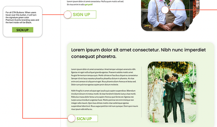
Conversion will be increased by including a strong, always present CTA button. Although the landing page is a single scrollable page, the CTA button should be easily accessible at any point during the user journey without having to return to the beginning or reach the end.
The landing page will answer the WHAT, WHERE, WHO, and HOW in short and succinct components while allowing the user to convert at any point in their journey.

Every section of the Forever Dream Wedding landing page should have a clear heading about the content found within. The sections should include plenty of white space and components that summarize neatly the information provided.
The CTA button will be present at every stage of the user journey. This will allow users to convert quickly and conveniently.
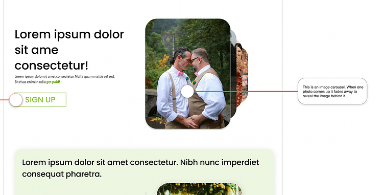
A photo carousel will be included with a variety of couple photos in order to be inclusive to all relationships and welcome all persons to sign up.
The sketch reflects a landing page that is inclusive, informative, and aesthetically pleasing.

The wireframes reflect the main design components that Ms.Taj liked from the Pfizer clinical research campaign such as the strong Hero, the commanding presence of the CTA button in an inactive and active stage, a floating CTA, and summary text boxes.
The Hero on the Forever Dream Wedding landing page will have a carousel of images that reflect a variety of couples in order to be inclusive to all persons.
There will be a floating CTA button throughout the user journey to make converting easily accessible.
Ms. Taj emphasized that she wanted the minimum amount of text visible to users. In order to maintain an aesthetically pleasing design we included text boxes to add dimension. The text boxes will have a descriptive heading with the option to expand them to reveal a short summary.
The design will be succinct but informative.
PROTOTYPE
The high-fidelity prototype for the Forever Dream Wedding landing page has to be aesthetically pleasing, remain consistent with the design of the host site, Premium Events and Design, and be informative.
The design for the Forever Dream Wedding landing page was inspired by the Pfizer clinical trial page with its use of a strong hero and clear CTA buttons. The website was designed with our user (Angelica and Gabe) in mind, who enjoy talking about their experience, appreciate a beautiful page and want to learn more before committing their contact info.
STRONG HERO
Forever Dream Wedding will be linked to the B3 social enterprise Premium Design and Events. It is essential for the event to reflect its mission in reducing the high amount of waste created by weddings and to benefit all communities.
It is a priority to reflect inclusivity so that any user who visits the site finds it relatable. In order to accomplish this I created a carousel of 4 images that has photos of a variety of couples.
The photo carousel will attract high-quality traffic and increase conversion because more users will be able to identify with the page if they feel represented.
CTA
The CTA button is present in the landing page. The button is in an inactive state and shows an active state when the user hovers over it.
The change from inactive to active stage will attract the attention of the users and is likely to lead to a conversion if they are sold on the mission statement of Forever Dream Wedding.
FLOATING CTA
As the user scrolls down the landing page a floating CTA button appears on the bottom right corner. This design was inspired by the Pfizer clinical research page which also had a floating CTA present.
The floating CTA makes it convenient for users like Angelica and Gabe (user persona) to sign up to be contacted.
Conversion will increase if the CTA button is always present and the user doesn’t have to scroll back to the beginning or reach the end.
TEXT BOXES
In order to prevent the landing page from being text heavy I designed expandable text boxes.
The boxes will provide an area for a summary heading– in this case that explains who is eligible– and the user can expand those to reveal a short summary of the qualification.
The expandable text boxes reduce text. If there is too much text on the page the user may become overwhelmed and abandon it. Reducing the amount of text that is visible will appeal to readers who look for quick interactions. Including a way to access more information will appeal to users who prefer to find out more.
Conversion will increase because we are appealing to users with a short attention span, without neglecting those who want to read more about the research.
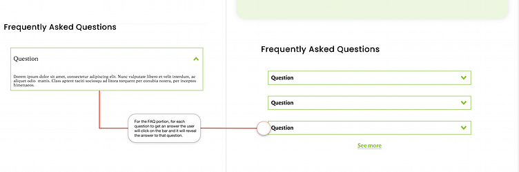
FAQ
Although persons like Angelica and Gabe are not likely to be returning traffic to the landing page, it is important that there is an opportunity to anticipate and address questions users may have.
Questions that may go unanswered in other portions of the landing page such as “how will compensation be disbursed” can be addressed in the FAQ section. This will allow users who are still on the fence to possibly convert.
High conversion is key because we are trying to have a minimum of 100 couples set up an interview. The FAQ is the final effort to convert users who aren’t sold on signing up earlier in the page.
SIMPLE FORM
The number of fields in the sign up form are kept to a minimum to encourage users to input their contact information.
Having 3 fields to complete will increase conversion. Although there is a risk of reducing high quality traffic sign ups, a screening survey will be emailed to the user before setting up an official interview.
The priority is to convince users to sign up to be contacted, further filtering will happen at later stages. Angelica and Gabe (user persona) will sign up if the form requires the minimum amount of information from them.
TEST / HAND OVER
At the request of Ms. Taj, she and her team will conduct the testing of the Forever Dream Wedding landing page.
Our team produced a manual with a table on contents for the handover in which all the components of the design are detailed, their intended functions, and resources for testing and tracking traffic and conversion on the site.


CLOSING THOUGHTS...
Ms. Taj was extremely satisfied with the Forever Dream Wedding landing page.
The landing page remained true to the design aesthetic of its host site Premium Design and Events. The site followed the design manual and emphasized the company’s signature green color as requested by Ms. Taj.
The motion graphics, vibrant signature colors, strong CTA buttons, and simple text all contribute to increasing high-quality traffic and conversion rates.
The Forever Dream Wedding landing page is beautiful but purposeful.
