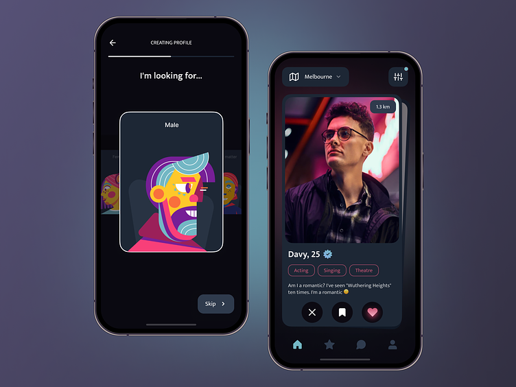
Dating App UI
💌 Have a dating app idea? Let's bring it to life together!
[email protected] | Telegram | WhatsApp | Website
Our team worked hard to create a sleek and user-friendly design for our new dating app concept. Let’s explore it in detail.
We chose a dark theme for the app because we know that users may spend a lot of time on it, and we want to minimize eye strain. The accent colors we used are vibrant blue and pink, which create a cool neon effect.
More by Ronas IT | UI/UX Team View profile
Like


