Nokia Logo Redesign
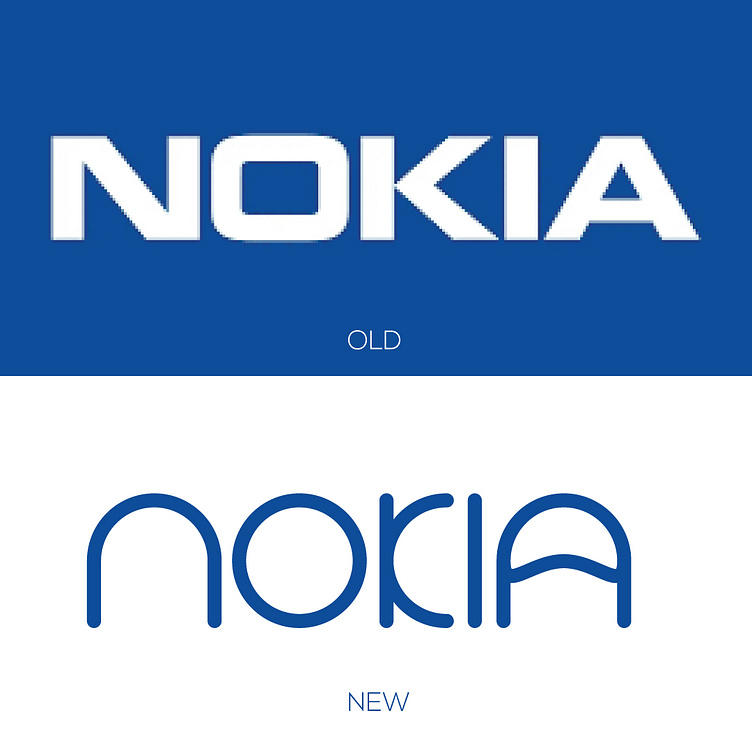
The new design of the NOKIA logo retains the iconic shape of the original logo while incorporating modern design elements to bring it up to date.
The new logo features a sleek, sans-serif font that gives it a more contemporary feel which reflects the brand's innovative and forward-thinking approach.
Overall, the new Nokia logo design is a fresh and modern take on the classic brand, while still staying true to its roots. This redesign showcases my ability to modernize and update established brands while maintaining their core identity and values.
Are you looking for the same project
which can make your business more profitable?
Direct Contact Whatsapp Messenger Skype Telegram
Email: [email protected]
