Organic Harvest

A vegetable company that has been established since 1980, wishes to have a new logo that is fresh and easily recognizable. The company, named Organic Harvest, provides various fresh vegetables for customer consumption, handling all production processes, from planting seeds, fertilizing, harvesting, and marketing with their own team.
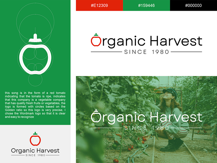
After discussing with the client, I proposed a Wordmark logo concept combined with a symbol. A Wordmark logo is used to make the company name easily recognizable. I included a tomato symbol as an illustration that this company provides fresh vegetables.
The logo features a red tomato to indicate ripeness, suggesting that the company provides quality fresh fruits or vegetables. The logo is formed with circles based on the Golden Ratio, making it very precise. I chose a Wordmark logo to make it clear and easy to recognize.