Space Travel Website Design System

I created a design system for Shuddle, an imaginary space travel agency.
The Project
The Shuddle website design system was the capstone project for Dan Mall’s Design Systems course offered by Dribbble in 2023.
In the project, an imaginary client requested three website designs for the various services offered by IPTS (Interplanetary Travel Syndicate), an imaginary space travel agency.

During the design process, we were to extract and incorporate styles and components into a design system, creating documentation along the way.
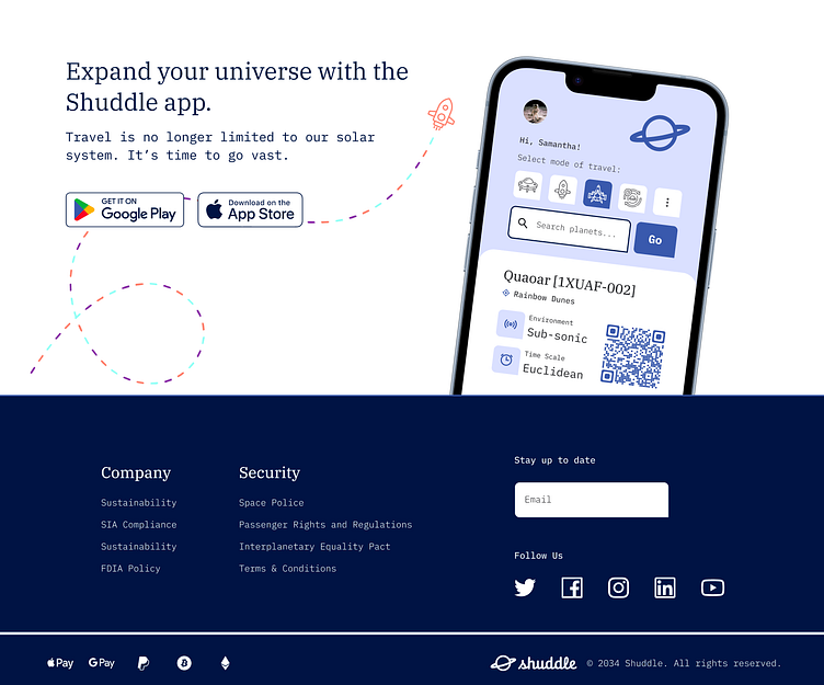
In the middle of the project, the “client” requests a significant design update to reflect their rebrand focusing on a younger target audience. The name was changed to Shuddle, and new logos, colors, and typography were to be implemented.
Using the design system, we were able to respond to this request with relative ease and efficiency.
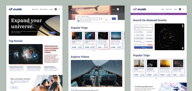
The final deliverables include three website designs for Shuddle, a design system in Figma, and documentation in Zeroheight.
IPTS
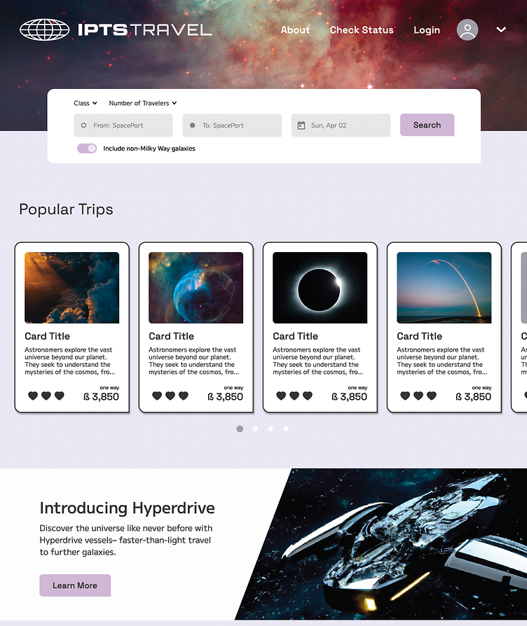
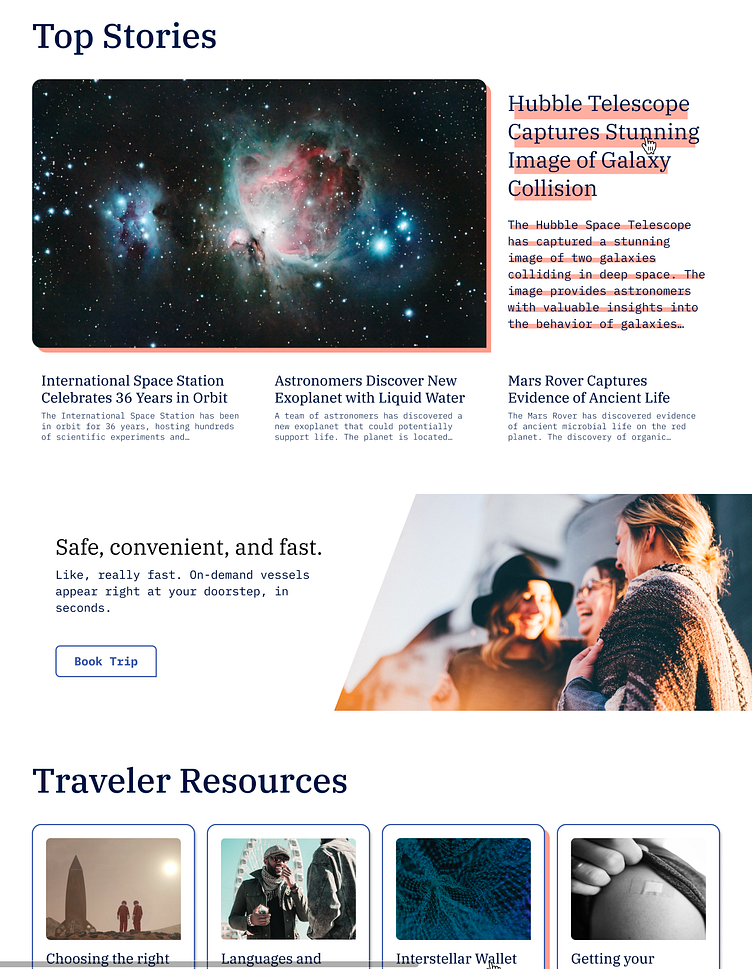
The three web products consist of an information site (IPTS.org), a travel booking site (IPTS Travel), and a real-time status checker site (IPTS Rail).
I began by brainstorming with a partner about details each service would offer, then referenced similar existing websites for inspiration.
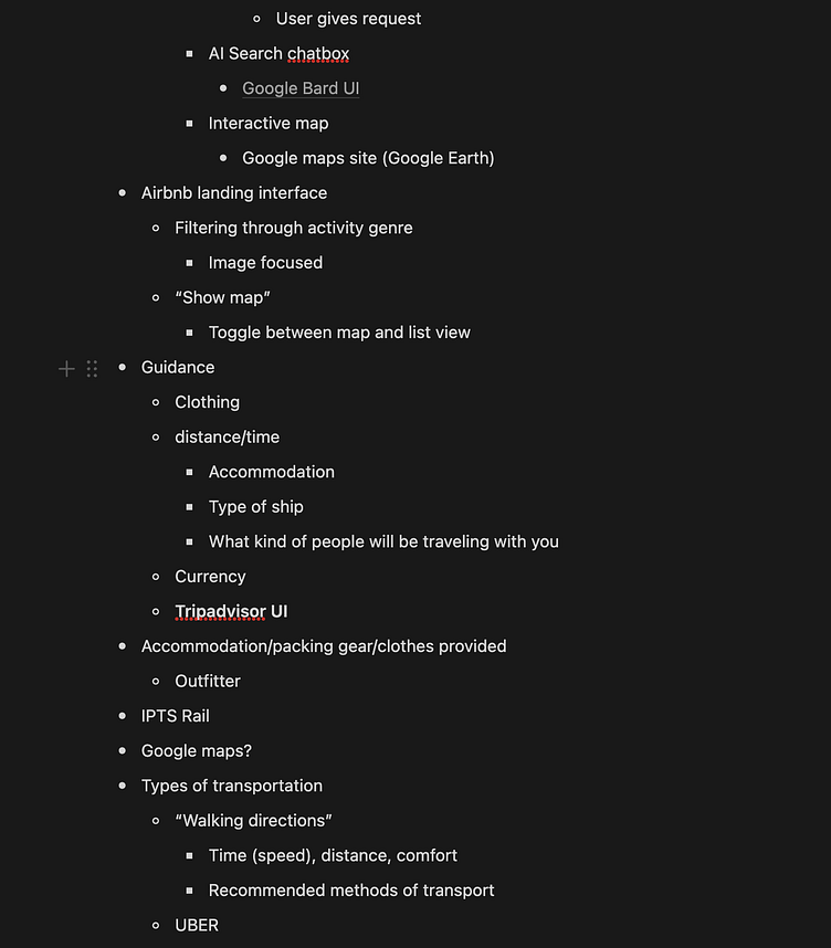
Once key features were determined, I created a simple wireframe to map out the layout of key components.
To visualize the web products, I sketched the color, typography, and style motifs to reflect the IPTS brand. IPTS, offering a sophisticated technical experience, was to be reliable, clear, and modern in its expression.
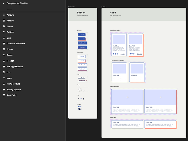
Wireframes were elaborated into a visual mockup using the typography and styles, and in the process, styles and components were extracted into the design system.
Note: Dan’s Dribbble course emphasized adding items into a design system only as they become necessary, and not to preemptively create components that might become necessary in the future. This is intended to make sure the design system stays relevant to build the actual product by extracting product-tested items. However, I found that a certain degree of preemptive work could be useful, especially for styles.
The Rebrand
In the middle of the project, the details of the rebrand were announced, and we were provided with new brand assets. The process of implementing these changes was relatively straightforward, but with a few challenges.

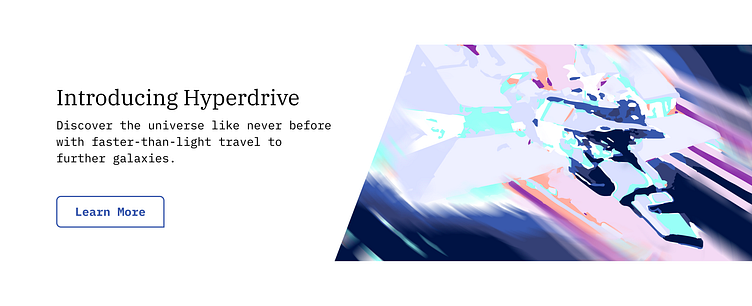
In the rebrand, Shuddle’s brand colors were specified. This somewhat conflicted with the existing color system, as the new brand contained more colors with different hues. I wanted to use the brand colors in the website without making the whole thing look like a circus. My approach was to use the stark brand colors for hover states and custom advertisements. By creating custom illustrations featuring brand colors in the ads, I was able to keep the website relatively simple while maximizing brand exposure.
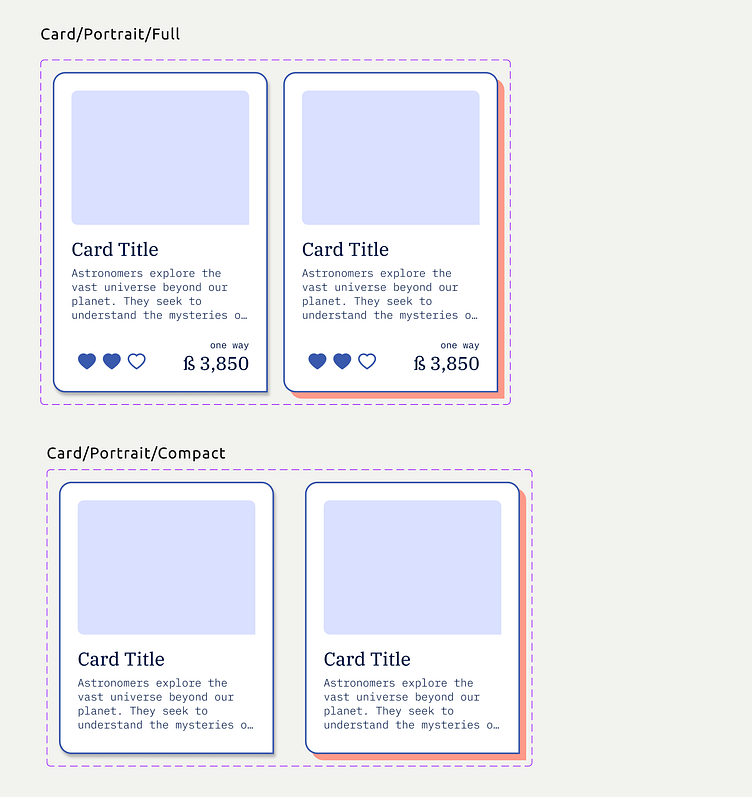
Modifying existing components for the redesign offered a chance to revise the structure of how I had designed the website.
I realized certain components were structurally built more for product design, not product maintenance.
For example, certain components utilized many variants and nested components. While this is convenient when designing variations, it can be difficult to navigate from the perspective of a design system user.
Since in Figma, the Layers and Assets panels only offer a view of the parent component, the design system user would need to have a deep understanding of the names and available states of each component in order to access the necessary variants.
I discovered in this process that it could be more effective to use rudimentary features and present certain components separately. In real life, this decision would be made according to the scale of the design system and skill level of its users.
Once the rebrand design was finished, I organized the names and reordered the layers of the websites to ensure efficient navigation.
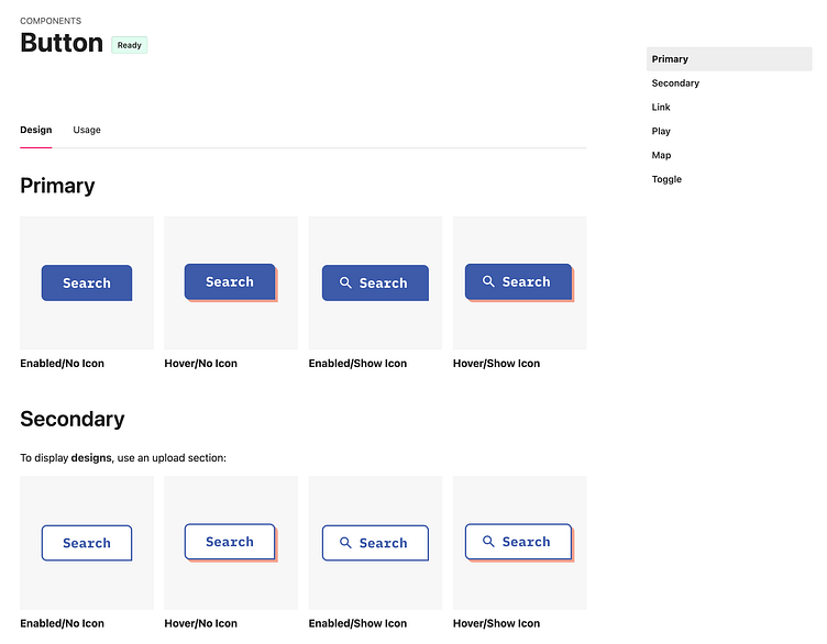
Wormhole Design Kit
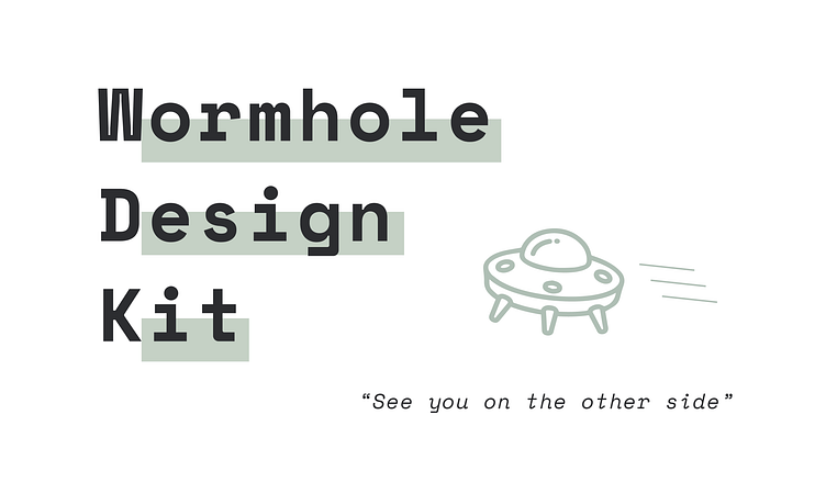
My design system for this space travel website project is named Wormhole Design Kit (WDK). The WDK was designed to be conceptually related to the product, yet clearly distinct.
The name is inspired by space travel, with a nod to the fact that design systems are used to promote efficiency (wormholes get you to the other side, quick).
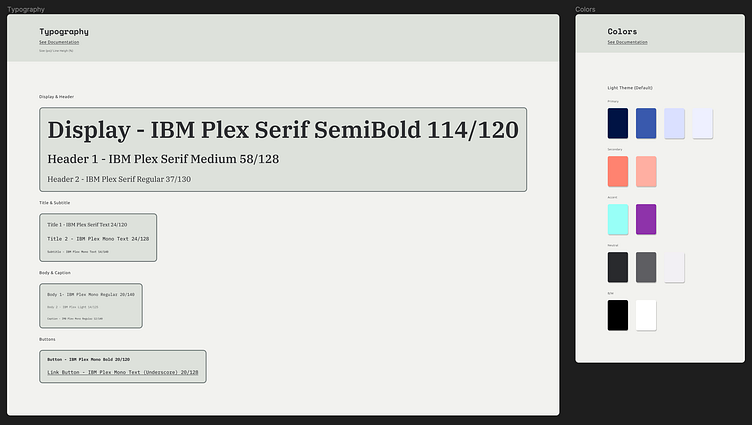
While Shuddle’s products feature a bright and youthful color palette, WDK embodies a neutral green-gray tone, allowing a clear mental separation when navigating the design system.
A type system was created specifically for WDK’s titles, subtitles, and captions.
Naming and grouping ended up being one of the most difficult aspects. This would be an aspect in which I would appreciate a collaborative discussion among the design system users to agree upon logical and intuitive naming conventions.
The documentation was created on Zeroheight, allowing the user to easily switch between the Figma file and a closer look at the reference literature. I did not focus on the details of the use case regulations for this project, and instead focused on a creating a easily navigable layout for styles and components.
Version 1.0 of WDK is exclusively catered towards visual designers, but I look forward to working on version 2.0 featuring code counterparts for the existing styles and components.
Takeaways
The project allowed a deeper look into a systematic design process focusing on scalability and quality consistency. Although this project was done alone, I am eager to work in a team dynamic to determine practices and protocols that contribute to a highly usable design system.
In terms of building the system itself, the aspect I found difficult was that all insights and directions had to be drawn from my own perspective. I felt that a small group of professionals with different skill sets working together could come up with effective strategies much quicker.
While the technical aspects of creating a design system is quite fun, I imagine the hardest part in getting a design system off the ground is buy-in. The social nature of design through decision making is fraught with landmines known as politics & personalities, so working to improve the collaborative decision making process seems to be the short cut to creating an effective design system.