NatraCure

NatraCure
NatraCure develops and manufactures therapy focused products for the professional healthcare market. Originally marketed to physical therapist, chiropractors, and orthopedic professionals, NatraCure saw potential opportunities in the direct to consumer market. The current branding and packaging lacked the design and messaging required to be successful with this target audience which prompted the rebrand.
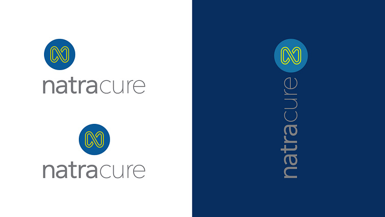
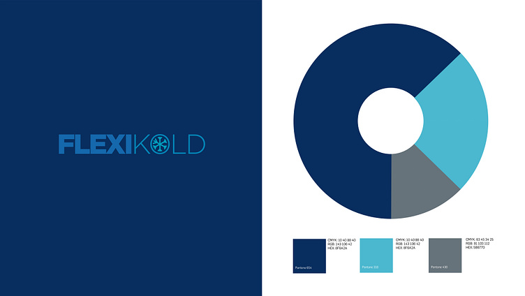
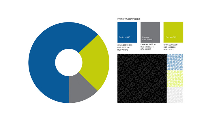
NatraCure is the consumer products division of PolyGel, the parent company. PolyGel develops patented gel technologies, synthetic fibers, far infrared fabrics and silver/copper yarns for the healthcare marketplace. To better reflect NatraCure's professional credentials, a repositioning that signaled the technologies built into the products was the driver behind the brand redesign. Working with the in-house team, the decision was to move away from the softer more natural visual positioning to one that better reflected changes in the company and the products developed. The assignment began with a brand audit and competitive review followed by a preliminary design exploration of the brand signature and related assets. The resulting identity centered around the "nfinity" icon and a restyled wordmark. The nfinity icon was designed to function as a stand alone element when applied to products and combined with the new wordmark for all other applications. Final deliverables included, the brand signature, a new color palette, the nfinity pattern, supporting iconography, fonts, packaging, product photo compositing, Amazon A+ content and print/online applications.