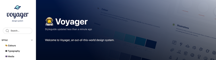
Introducing Voyager: an out-of-this-world Design System

Buckle up and prepare for a space adventure because I have a great story to tell.
In the Scaling Design System Dribbble course, I was tasked to design not one, not two, but three websites for a space travel company. On top of that - no surprise here - I also had to create a design system to ensure that all three websites had a cohesive look and feel. Challenge accepted! 😎
The goal
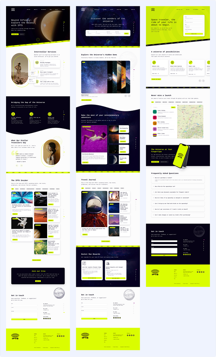
Create 3 websites: a company informational website, a booking website for space travel and a real-time update website to check routes all over space.
Develop a design system to simplify the design process and ensure that all products have a cohesive design and look & feel.
My role
As a member of the design system course, my primary role was ensuring consistent designs across all products and creating a scalable design system for future team members.
The adventure begins
Let's set the scene. The project had just started: two weeks time to finish it. Three websites to build. One Design System to set. And only one logo as a reference. I was up for the challenge and excited to get started. Here's how I kicked off the adventure:
Research
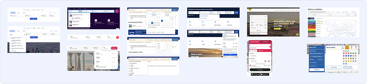
First things first, I conducted quick research to understand IPTS's needs and the general structure, content, and visual styles required. This included reviewing websites with similar purposes, such as travel, booking, and rail sites.
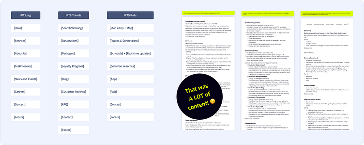
Mapping out structure and content
Without any specific briefing or content, my very first step was to map the structure and content for each website. As a team of one, I used Chat GPT to help me with that.
Collect & Connect: starting an inventory
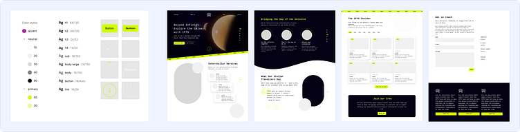
Systems are all about connections. With all wireframes done, I collected and connected common components within the pages, creating the first draft of my Design System.
At this point, I wasn't focused on their exact structure or design but rather on their goal and functionality. This helped me to understand the necessary components and their relationships with one another.
Designing Pilot: testing & building (with) confidence
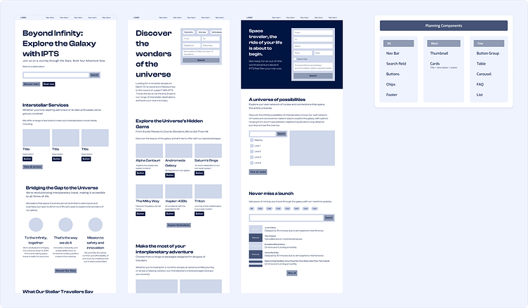
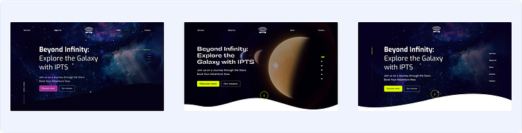
Next, I created a Pilot design. Design System components should be extracted from real products rather than rely on pure guesstimations. With that in mind, I started sketching the first website, the .org, by testing key elements and styles, such as sizes, colours, and typography. Then, I created purposeful components and styles, focusing on the product without over-designing it.
Abstracting & extracting components
Using the Pilot design as a basis, I designed the other websites by extracting the necessary components and ensuring consistency across all three products.
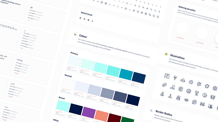
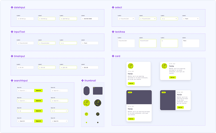
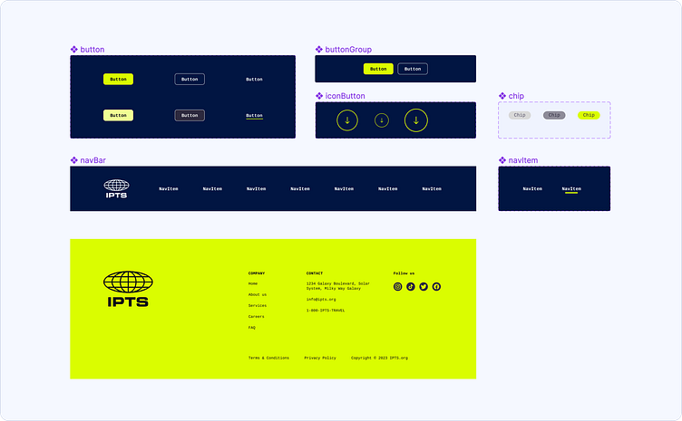
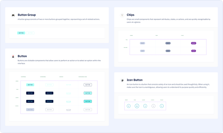
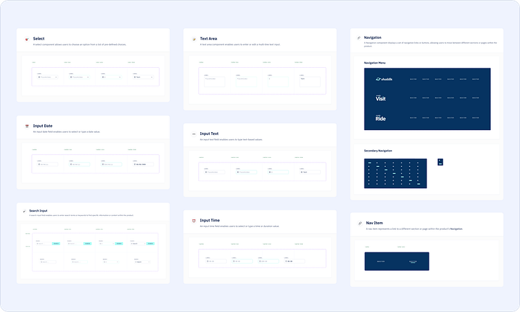
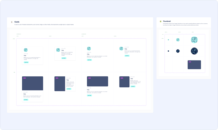
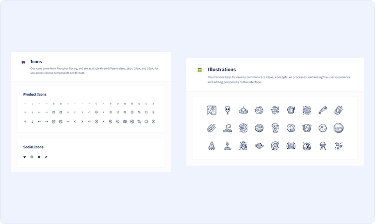
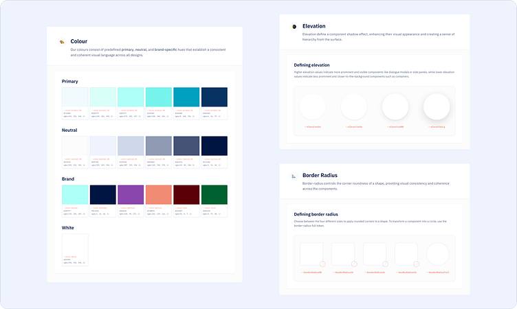
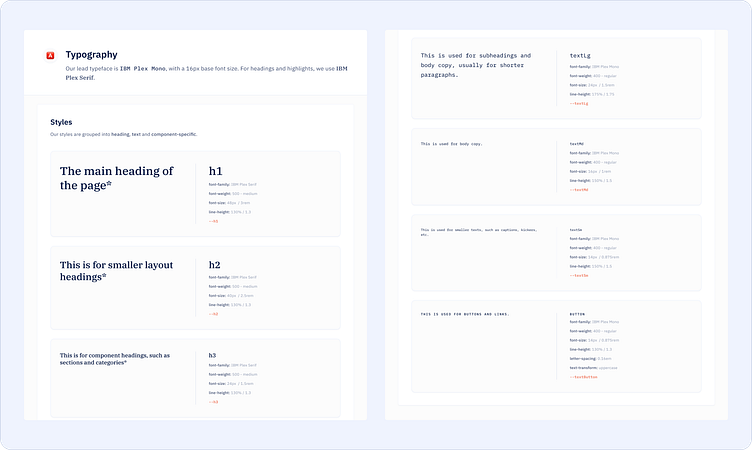
Habemus a design system: creating the library
Finally, it was time to create the library. I structured it by auditing and collecting all the common components from the designs and refining them in Figma. By prioritising software, I replaced them on the design and refined them as needed, making sure they were functional and easily reusable.
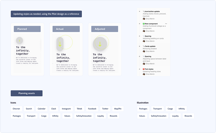
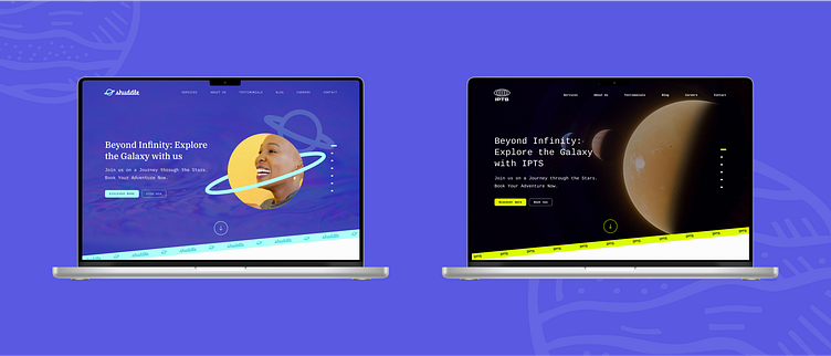
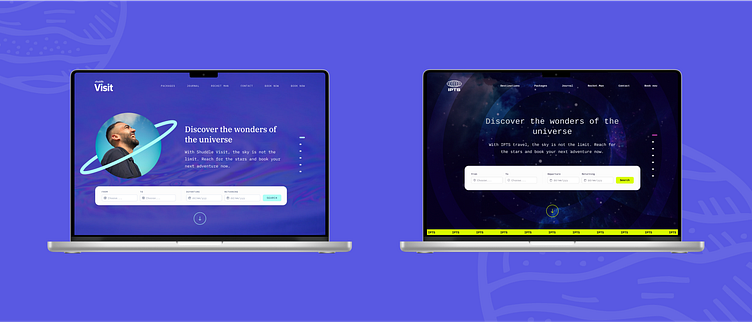
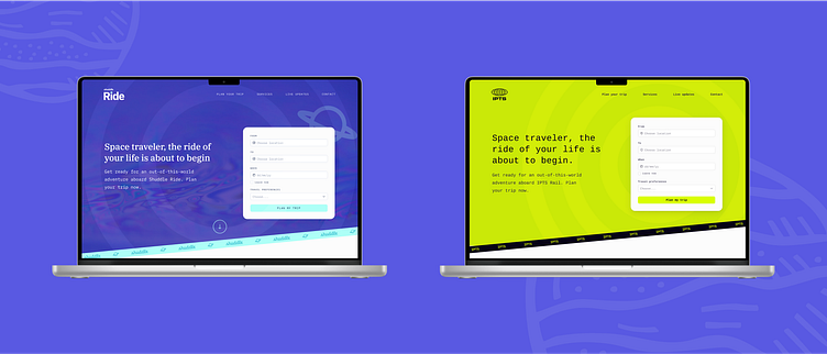
The turnaround: adapting to rebranding
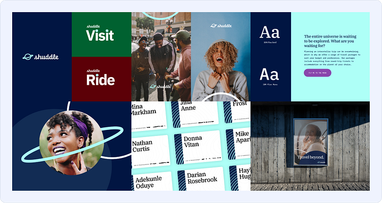
Imagine the scene: it's a sunny day, birds are chirping, and... IPTS decides to go through a rebranding process. That means a new name, new colours, new typography: everything had to be updated.
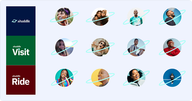
IPTS.org became shuddle.world, IPTS Travel was now Shuddle Visit and IPTS Rail was now Shuddle Ride.
It was like the ultimate test to see how change-proof the system was. But there was no need to panic! Like any good system, everything was connected in Voyager, and adapting to the company's rebranding process was a breeze.
These were my steps on the second phase of the mission:
Saving versions of the old designs and duplicating the Figma library. This would ensure everything was documented and organised.
Updating the new Figma library. Since the file already had well-established styles and components, adjusting colours, fonts, and other details was simple. The new look & feel was applied throughout the library with just a few clicks.
Publishing the new library and replacing the old components. This was quite simple by using the Swap library feature in Figma. It was like a magic trick, and the design transition was smooth and efficient.
Final refinements. Lastly, I made some final adjustments manually, such as updating the website copy, refining components and styles like sizing and spacing, and ensuring everything looked better with the new identity, using the Pilot design as a reference.
The biggest challenge was to review the assets like images and illustrations, which wouldn't fit the new brand, but overall it was a huge success.
I was over the moon with what I had accomplished! It was amazing to see the results.
Before & After
Reference Website
I wasn't just designing like crazy - I was also taking notes along the way. I created a reference website so others could learn from the process and better understand the system. The official link is coming soon.
Next mission
The adventure doesn't end here :) I'm excited to keep scaling the Voyager design system and take it to greater heights. Here are some of the things I'm looking forward to:
Adding new components as Shuddle evolves as a company.
Creating crystal-clear documentation for every component, with usage guidelines and specs.
Ensuring consistency across all devices by creating a mobile design library.
Writing a "step-by-step" article explaining the technical parts of building the library.
And last but not least, I'm ready to challenge myself by building a dedicated dev library in React. Bring it on! 🚀