New logo and rebranding v2
Context: rebranding 2019
The new rainbow logo, delivered from an external agency, was a bold move and opened a lot of design possibilities. However the checkmark was too generic to be used without the rest of the logo. We needed a more recognisable icon.

The gradients also needed more attention - they had to be vivid enough to represent the brand, have enough difference to form a beautiful palette and look good on dark background. After some trial and error......
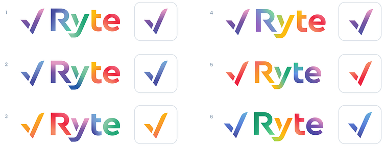
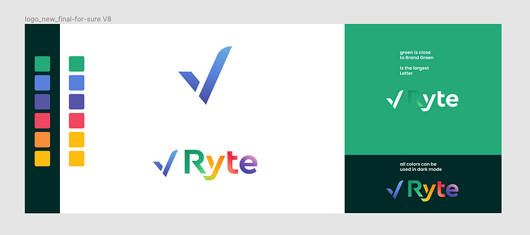
......I came up with the final result, that was loved by all the stakeholders:

By then the company made a strategic decision to choose green as our new brand color. It took another several rounds to find a suitable balance between bright and accessible, so we ended up having 2 green tones instead. Brand green for graphics, big titles and interface elements - and darker green for the texts and buttons.


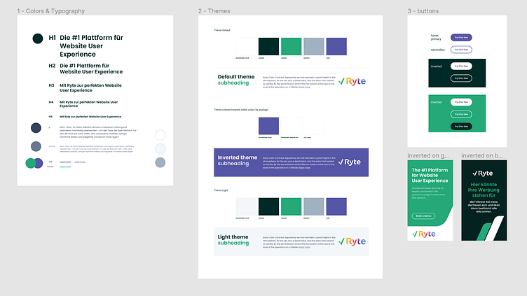
Applying those colors to new templates were already an easier task :)
