Creating & Using a Design System to Power a Redesign: Case Study
Introduction
I'm writing this case study as a Figma noob who was looking to gain a deeper understanding of Design Systems, how to make them, use them, and apply the knowledge to products at my places of employment.
I took Dribbble's design course, Scaling Design Systems, taught by Dan Mall.
The following is the design brief we received as students of the course, followed by how I approached the assignment, and my experience with it.
The Design Brief and the Redesign
Part 1: IPTS
You’re the Head of Digital for the newly launched IPTS: the Interplanetary Travel Syndicate, a bustling transportation network that shuttles people from world to world within our galaxy.
Your leadership has decided to launch with 3 unique offerings:
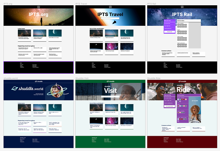
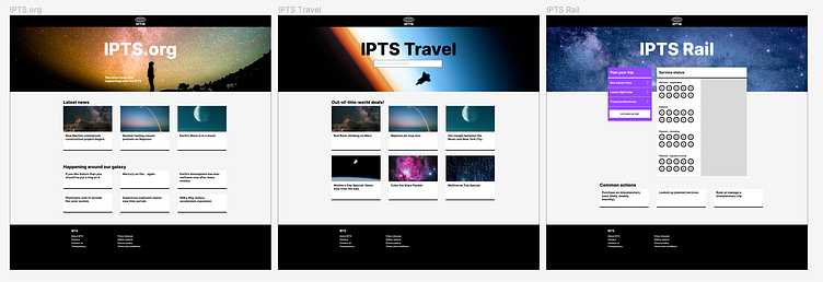
ipts.org, an informational website where you can find the latest news and happenings with the IPTS
IPTS Travel, a website where you can browse and book travel to and from multiple destinations within our galaxy. Like Expedia for space.
IPTS Rail, a real-time updated web app where you can view lines, routes, and times for all the different commuter lines. Think NYC subway or the London Underground, but for interplanetary travel.
Part 2: IPTS becomes Shuddle
Your leadership at the IPTS—the Interplanetary Travel Syndicate—just hired the prestigious branding firm MegaBrand to do a rebrand of the entire organization, and there are a few things that’ll affect the three products you’ve been working on.
MegaBrand discovered through focus groups that the IPTS name and logo felt very ominous, like it was cold, faceless corporation that was always watching. (“The eyeball-shaped logo doesn’t help,” said one candid participant.) In addition, the IPTS wants to appeal to a younger demographic.
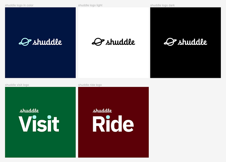
After weeks of research and exploration, they’ve settled on the new name “Shuddle,” which feels more like a cool, new startup.
The 3 main products have also been renamed to feel more like a family of products instead of independent offerings:
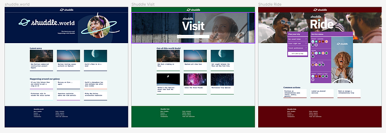
ipts.org is now shuddle.world
IPTS Travel is now Shuddle Visit
IPTS Rail is now Shuddle Ride
Role
My job was to create all three websites. Each website had to be at least 1 page, but each page had to have at least 5 components on it. I was to make a design system to help with this effort.
For the redesign portion, I was to update the IPTS products to the new Shuddle branding, and update the reference site to reflect the new brand, both in design and content.
Approach
I went into this assignment focused on 3 things:
Keep things simple as personal time to accomplish the assignment was very limited.
Actively resist the innate designer temptation to put blood, sweat, and tears into making things incredibly attractive, because bullet point 1.
This was an assignment to demonstrate that I understood and knew how to implement the concepts taught in this course. Aim to meet the minimum requirements. See bullet point 2.
As a former New Yorker, I enjoyed seeing the NYC subway as a reference site mentioned in the brief. The memory of it that stands out to me most is how it really made getting around the city super easy (when it was up and running).
The bold font, block-y UI elements, and the "no muss, no fuss" overall appearance felt very much in line with my goal to keep things simple.
Solution
I used the same general layout of the NYC subway site and asked myself what elements I'd repeat across all 3 products in order to justify the creation of a component, and why:
header nav: a place to "brand" with the IPTS logo, which was supplied in the brief
logo: there are two variants already supplied, so it screamed at me to make it a component
hero: an opportunity to both immediately distinguish the products and to play with the images from the Unsplash plug-in
footer: this is something a website feels weird without
card: it's flexible enough to use for latest news, travel deals, and more opportunity to play with the Unsplash plug-in
For the redesign, I updated all of the above components with the new color palette, typography, branding, and photography.
Learnings
Figma is magic! I am from the "dinosaur" era where my title was "Web Designer" when I first entered the Design space, and the popular tool for UI design was Photoshop. What a joy it's been to see firsthand how far UI Design tooling has come!
While it was challenging to chronicle-as-you-go because it felt really disruptive to the creative process, thinking of it as part of the creative process helped shift my mindset.
It's better to publish the component library right at the beginning and just continue to publish along the way so that you create a history of progress and changes. I made the mistake of waiting toward the end during IPTS, but learned to use it for chronicling for Shuddle.
Overall the new look and feel proposed by MegaBrand did not go over well in a Zoom room full of designers.
This is a valuable lesson in learning how to deal with a redesign you don't really like, but have to do regardless, because that's the job.
Thank you, Dan Mall and Dribbble, for the wonderful opportunity to learn and to take on a challenging, but fun, project.
S/O to Rick James! Chatas and our cohort for all the support and mentorship. You guys rock.