Website Section Icons v2
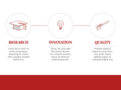
Been updating these icons in preparation to launch a corporate re-design. I found a few problems with the previous ones in that they didn't seem to gel together too well, and the icon on the right for 'quality' wasn't clear enough - hopefully these are!
Any feedback would be much appreciated.
More by Gideon Caspi View profile
Like

