ZenQ logo design | V1

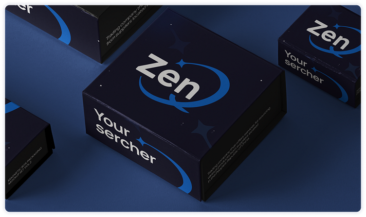
Trading company that offers services for sourcing various products from suppliers located in the People's Republic of China.
With a focus on quality, the company helps clients worldwide to procure goods and arrange their delivery.
"Upgrade our company logo while keeping its core concept.
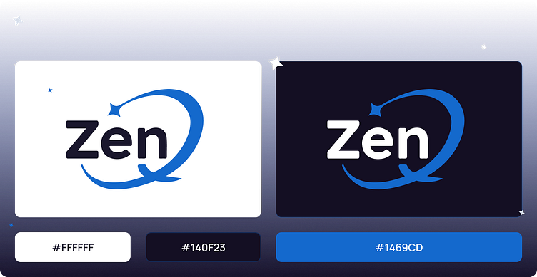
We need it to be readable, minimalist, and versatile in use."
Process
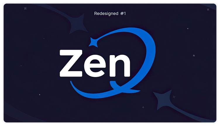
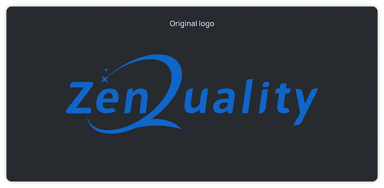
During the rebranding process, the company decided to change the name of their logo from "Zen Quality" to "ZenQ". We made this change to create a more memorable brand.

Enter your text This version is the result of modernization and simplification of the original Zen Quality logo.
- The font was redesigned to have a more modern look with slightly rounded corners, which gives the logo a dynamic and modern look. - Updated the letter "Q" by enlarging the main star that forms the letter, which improves its readability. - Removed the smaller star that was previously included in the logo, as it loses legibility when the logo is reducedhere...
These changes resulted in a more modern and flexible logo that adapts well to smaller sizes while still preserving the original brand concept.