Recycle logo design
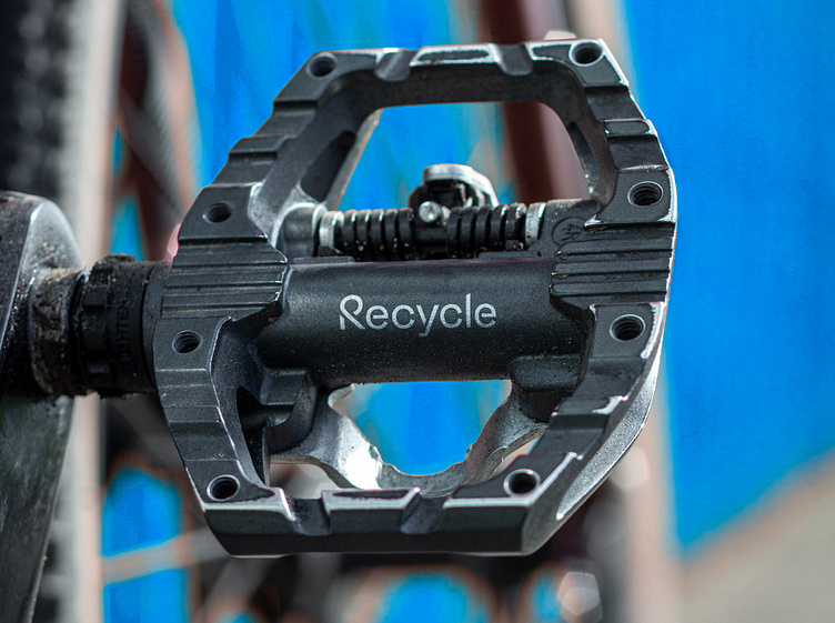
Recycle reuses and recycles old bicycles for use as either a refurbished pedal or a spin bike to help battle the careless waste we see in the world every single day. Out of the brief, I pulled out key words such as modern, energetic, clean, simple and unique which I wanted to ensure was present in the design.
This logotype features a completely bespoke typeface centred around the capital R which is made to look like a side-on view of a bike pedal. I don’t pretend to be a type designer by any means and so it took a fair while to make sure the letterform was weighted and balanced appropriately. But once I did, the rest of the typeface fell into place much more easily by modelling it on shapes found on bicycles whilst ensuring it complimented the R and embodying the key words outlined in the brief.
Once I had refined the logotype, I set to work on building out the rest of the identity. With the logo being very clean and angular, I wanted to bring in some more personality in the form of a supporting colour palette which consisted of bright blue and red along with a playful tone of voice. This meant that users have a fun experience with the brand whilst it still feeling professional and aspirational.
Ready to create or refresh your brand's identity?


