Lululemon website redesign
I did a little redesign of the Lululemon landing page.
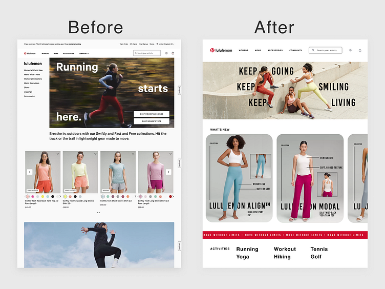
Firstly, I love lululemon, but I always felt like like the landing page of their website was too cluttered and lacked organisation. When I visit the site, I often have no idea where to look. With the new design, I added a clear 'what's new' section on the homepage for convenience, particularly for regular customers who just want quick access to any new releases. With the original design, the landing page is very long with lots of 'ad' like sections. With the redesign, I opted for fewer sections so that the customer can clearly see what they can find on the landing page and when to go to the navigation bar.
Thanks for viewing and I would love any feedback!