UI Concept for Credit Card Payment Program
Hi, Dribblers!
Goal of Case:
I want to share with you of my concepts for UI design, which wasn't chosen because of the strict corporative style. I really like the colors & fonts, so I hope you'll like it as well :)
Design Goal:
To create a fresh look&feel for the old website for Credit Card Processing Payments.
Fonts
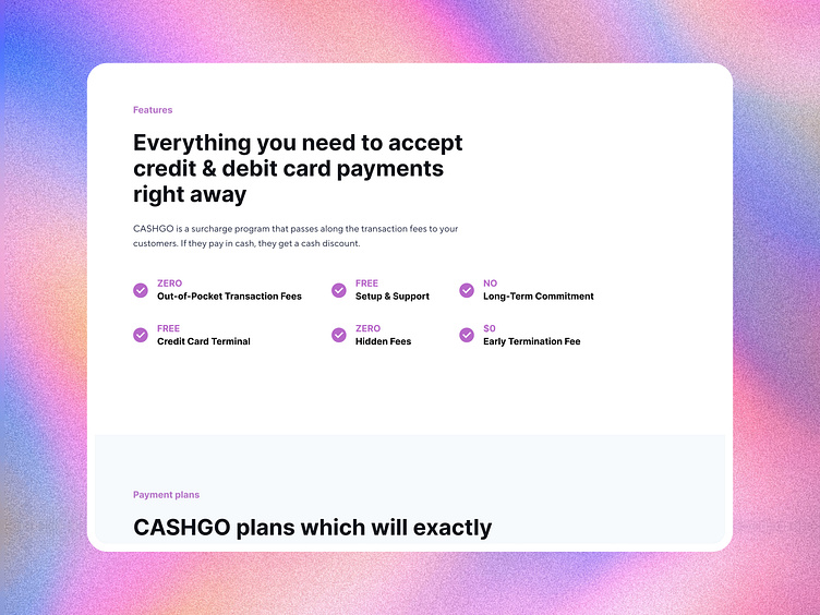
I'm using here a combination of two colors - Inter for Headings and IDT Sans Font for body texts.
Colors
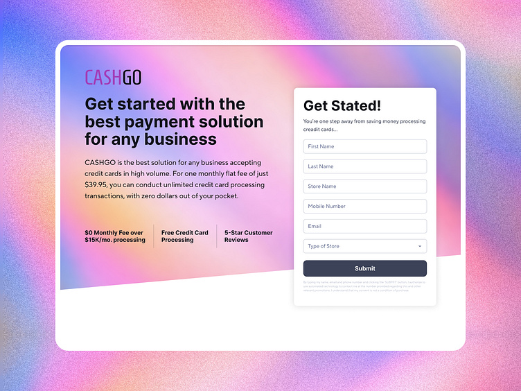
I've took the colors from the existing logo and gave them a fresher look. Now there is one prime color - bright lavender, which I combine with white & slightly blue backgrounds. Also, I have a gradient, which is being used only in several places - like the very first block and some CTA blocks.

Visual language
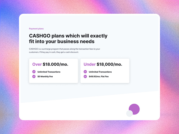
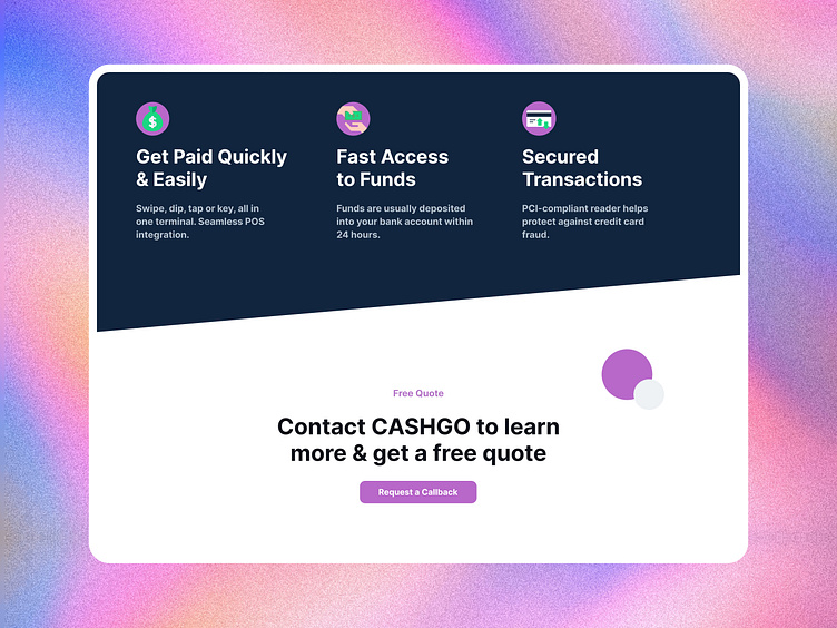
One of the key elements I use are the colored circles. They can be used to fill the "angle" emptiness and also to make the images more playful and catching. It's also creates the mood of easiness and simplicity.
Thank you!
I'll be happy to see you comments and likes ;)
